10 World’s Most Recognized Brand Logos With Cost Factor for each Logo Design

In our everyday life, we come across various multinational brands with amazing strategies and campaigns. Whenever we see an advertisement of any business giant, one of the most important and catchy elements is its amazingly crafted logo. A brand’s logo is ist symbol of excellence and uniqueness. All of the attributes of a brand can be directly or indirectly related to its logo. You can just tell about a business’s name, products, and services after seeing its logo.
Hence the logo is one of the most important elements of any brand’s identity and individualism. Some of the logos of the famous brands were more costly than you can even imagine and many of the businesses got their remarkable and ever-vibrant logos at relatively cheaper prices. The design, color strategy, and basic theme of a logo matter a lot but the price of designing an engaging logo with all the essential visual elements is also a factor to be considered crucially. How much some of the most expensive logos cost? Following are some of the most popular logos with the cost that was paid for their design.
1. BBC Logo
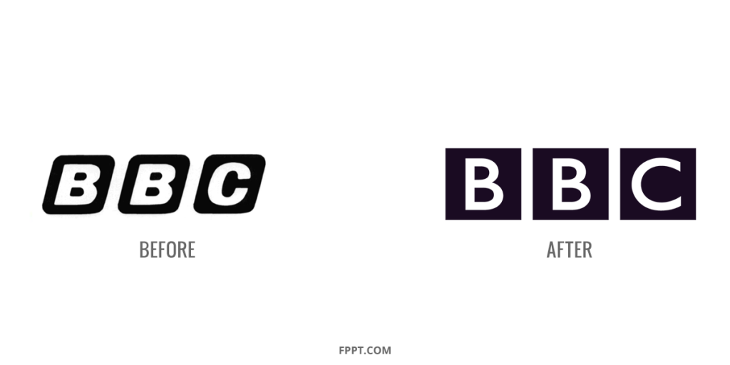
The UK-based famous broadcasting company, BBC pays significant attention to its branding and advertising strategies. The logo first came into existence in 1950 and later on it was redesigned in 1958. In 1997, the BBC Blocks was introduced for the expansion of the corporation across the media industry. After that for a couple of years, frequent changes have been made into basic design and color strategies of the logo and most recently a final look has been imparted to the company’s logo with a staggering cost of 1.8 Million USD.

The astonishing cost has been paid to change certain design elements of an existing company’s logo. The combination of black and white provides a significant elegance factor to the design of the logo and illuminates the brand name of the company with a certain attention-grabbing factor.
2. British Petroleum (BP) Logo
Another UK-based multinational conglomerate, the oil tycoon, BP is not an unknown name among the masses. The famous oil company can pay huge amounts on its marketing campaigns and can pay even higher for getting a completely new logo for its brand. This assumption actually came true in 2008 when the company totally redesigned its logo for the mind-blowing sum of 211,000,000 USD. This is huge and costs more than the total value of some businesses. Although the color strategy was kept the same, there were changes made in the design elements of the logo.

Luckily the newly designed logo went well with the existing brand image of the business and is still showcasing the uniqueness of BP across its global presence throughout the world.
3. Accenture Logo
The famous multinational internet, management, and consulting services providing Irish company, Accenture also does not stay behind in the race for acquiring one of the most expensive and impressive logos in the world. The famous brand paid 100,000,000 USD for the brand logo which is a quite heavy price for a logo design.

The logo comprises the company’s brand name in lowercase with a sign of accent above it. The logo conveys the brand’s message “accent of the future”. There were almost 50 other options that were considered before selecting a version of the logo. The ultimate black color of the logo is a sign of uniqueness brand superiority. The logo incorporates the company’s name in it which is also a part of the marketing strategy of the business.
4. Google Logo
Whenever someone thinks of some of the top company logos, it is difficult to ignore the ever-dynamic and evolving global search engine which is Google. Google may be one of the only companies that change its logo with respect to specific historical events and dates throughout the world. That’s why Google is one of the most celebrated and recognized brand names in the world. The amazing feature about the iconic logo of the tech conglomerate is that its basic version was created by one of the owners of the company himself, Sergy Brin. Hence zero cost was paid to develop the basic version of Google’s most dynamic logo.
5. Symantec Logo
NortonLifeLock Inc. formerly known as Symantec corporation is well-known software development, and cyber security providing company based in Arizona, USA. Being a member of the fortune 500 club, Symantec leverages its extensive business network and spends millions of dollars on its branding and marketing strategies. One of the examples of the marketing expenditure of the company is that the company paid an enormous amount of 1,280,000,000 USD for designing its single logo that is also currently in use for the business brand image building strategies. As the company provides the SSL certificate services too, the symbol of the tick on the top of its logo represents the safety and trustworthiness aspect of the business. The amazing combination of black and yellow in the logo is equally eye-catching and inspiring at the same time.
6. Posten Norge Logo
The Norwegian postal service brand, the Posten Norge had once the monopolistic stature in the Norwegian market regarding sending and receiving packages which had a weight of less than 50g through Norway. The company is owned b the ministry of communication and transport of Norway and spends a fortune on its countrywide branding and marketing campaigns. The company spent 55,000,000 for the development and design of its logo and has been using the same logo for quite some time now. The grey and red combination of the logo also includes the brand name of the business and conveys a proper message through its amazing color combination and visual elements. The word “Posten” in the logo, which is also part of the company’s business name, means “the post”. Hence by conveying the message of business service through its logo as well as business name, the organization sets an actionable, and clear example of the effective marketing strategy of the company.
7. Australia & New Zealand Banking Group Logo
The Australia & New Zealand Banking Group which is a joint venture of the two famous countries in the Australian continent is an established business in both New Zealand and Australia. It is the third-largest bank in New Zealand and 5th largest bank in Australia. The company’s logo depicts three letters which are “ANZ” written with the blue texture with a specific font style. The company’s logo had a design cost equal to 15,000,000 USD which is quite expensive for a logo with no significant ensign elements in it. The logo contains only a few white horizontal lines in the center of three letters and the rest of the area is colored blue. The heavy amount paid for the logo was in fact a part of a much bigger marketing budget regarding a business marketing campaign that ended in 2012. The blue color in the logo conveys the meanings of safety, peace, and trust to its customers which are the most desirable attributes that can be imagined by any bank.
8. Pepsi Logo
The beverages conglomerate, Pepsi also spent 1 Million USD on slight changes in the design of its company logo. Although there were very few changes that were made in the final design with red covering a bit more area and a slight tilt in the angle of the logo, the overall structure of the logo remained the same.
The main purpose of changing the design strategy of the logo was to challenge its most iconic and biggest rival, coca-cola which still enjoys the number one place from all the cola drinks in the world. The red color increases the appetite and urge of the people that makes the beverage more desirable for them. The strategy is somehow similar to Coca-Cola as it also uses the red color as a major component of its logo structure. But being in fierce competition with brands like Coca-cola, it can be effectively understood why a business would spend 1 million US Dollars on the development of a single logo.
9. London 2012 Olympics Logo
The Olympics event is no strange activity to anyone. In fact, it is one of the most wanted and celebrated events in the world regardless of different boundaries, and cultures. The event of Olympics 2012, specifically is one of the most remarkable sports events as the organization spent an enormous amount of 625,000 USD on just the logo development and designing process of the event. This was one of the most expensive logo designs made for the Olympics ever.
10. Belfast Logo
Belfast, the capital of Northern Ireland is a place that is stacked up with tourists every now and then. The country has previously spent enormous amounts of funds for promoting tourism for its old and turbulent history. Belfast spent almost 280,000 USD on a single logo design with a purple heart with a “B” letter in it. Later on, different colors were introduced like Maroon, Fuschia, Lime, Blue, and Aqua in the main design of the logo however the graphics and visual structure remained the same. The purpose of choosing Purple color in the first place was to depict the elegant natural beauty of the city for attracting tourists.
Final Words
A business logo of any company tells a lot about its features, products, or even services. Your business logo should convey the right meanings, feelings, emotions, and prospective urges to the potential consumers to get effective branding and marketing results. Different corporate logos of famous brands have hypnotized consumers throughout the world to remain loyal to their favorite brands for years. These logos may have consumed a fortune in their development but the ultimate ROI is much higher than the initial design and development cost of the potential logos. Hence developing an effective logo comprising of certain budget sacrifices (if applicable) is imperative for businesses to get the necessary headstart in their growth journey in the practical business world.
