Why Use A Flat Design For Your PowerPoint Presentations?
Many websites and apps have switched to a flat design in recent years, The initial transition seemed a little odd to end users, as there no longer were 3D elements in UIs and the interface of such apps and websites seemed less attractive than the glossy three dimensional designs we were used to. However, be it the Modern UI of Windows 8, the overhaul of all major web apps with a minimalist flat design or PowerPoint Templates with flat designs, the UI has more to offer than you might realize.

Why Use a Flat Design?
A flat design has many advantages. It is easy on the eyes, minimalist and can help reduce the complexity and loading time of your website or PowerPoint presentation. Hence, a flat design is more optimized (so to speak) and can help you present your slides with a fair amount of visual appeal, without compromising on optimization.
While you might want to use a three dimensional design for your slides, however, if your content is too heavy or the system you are running your presentation on isn’t powerful enough, you can end up with embarrassing hangs and slides that don’t load properly.
Below is a video that provides more details regarding why a flat design can be useful for your presentations.
Flat Design PowerPoint Templates
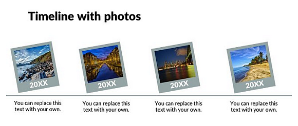
Presentation Process provides some amazing Flat Design PowerPoint Templates which are easy to customize for making professional presentations with a minimalist look.
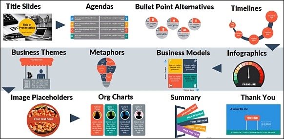
The Flat Design pack by Presentation Process contains more than 750 highly customizable slides, including editable business diagrams, comparison slides, generic layouts which can be moulded for any presentation topic and other innovative designs which can be incorporated for a range of presentations related to IT, science, law, for making class lectures and more.
You can download the Flat Design pack for both the Windows and Mac editions of PowerPoint, as well as use them with Keynote, OpenOffice, Google Slides and Kingsoft WPS.

