Visualize And Analyze Your Hierarchical Data in Excel With HierView
Microsoft Office programs such as Word, PowerPoint and Excel have been around for so long. They’re widely recognized and used in many business and academic activities, and considered as reliable companions in creating documents, managing data, or presenting an idea. While these programs are great in themselves, add-ins are there to make things a little easier so you can work faster. With add-ins, you can extend the functionality of your Office applications, so that you can do more without having to leave your Office window, subscribing to a service, learning a new app, or going to a different platform. Using HierView, you can visualize and analyze your hierarchical data in Excel.

Create Captivating Hierarchical Structures with HierView
One great example is Appuccino’s HierView, a smartly named visualization tool to help you create hierarchical data displays. HierView is a free add-in for Excel that allows you to create cool hierarchical visualizations that you may need for school or office use. The hierarchies created are different from the presets already available in Excel’s SmartCharts, so you can expect a refreshing change to your data visualization.
HierView is compatible with Excel 2013 SP1+, Excel 2016+, Excel 2016 for Mac, and Excel Online. With these programs, HierView is easier to use and can make it fun and easy to create hierarchies for organizational charts, family trees, and more.

Take Excel to a Higher Level with HierView
To get HierView, you can go visit the Microsoft AppSource portal. This is a resource for all your Office add-ins so that you can extend the functionality of your existing awesome Office apps. The portal offers hundreds of apps from the most reliable developers and companies, so you can be sure to find some that you can’t do without.
You can search for your desired app, in this case, HierView, in the search box. You can also take a tour and try out the Featured Apps and see a wide range of add-ins you never thought you’d need. You’d be surprised and delighted to see great apps to cater to all your needs.
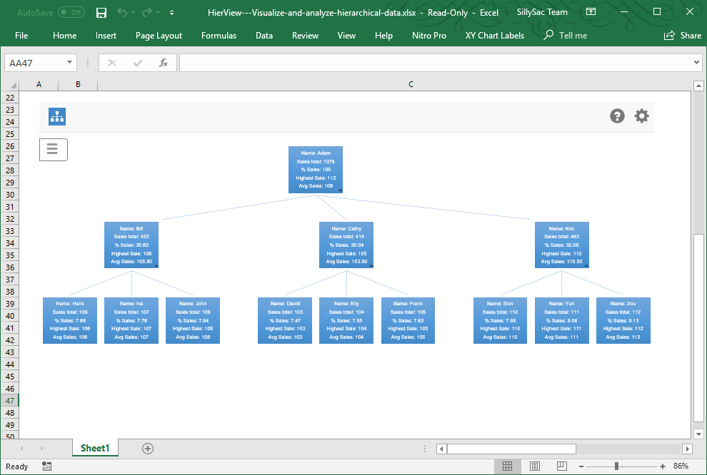
You can also get HierView right within the Excel app. Just go to Insert -> Add-ins ->Store. From here, a dialog box will appear, where you can choose the app that you want or search for it specifically in the search box. Once you find the app, just follow the installation procedure. You will then see a sample hierarchical structure that you can customize with your own data.

Get Easily Customizable Organizational Structures
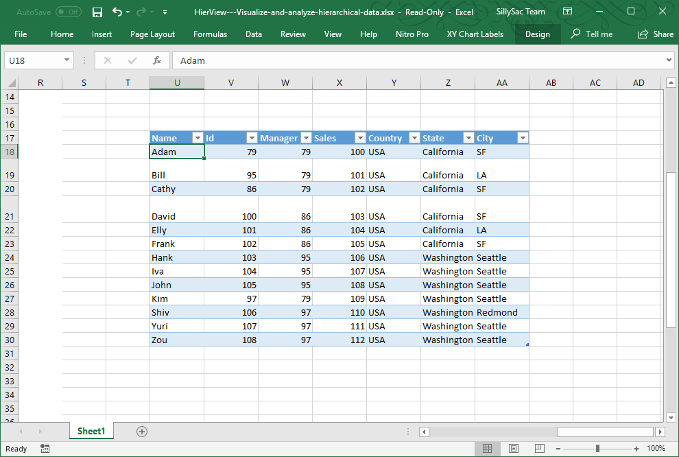
When it comes to HierView, Appuccino make things easier, and the results are beautiful and eye-catching. All you need to do is include a data that has a row identifier with the information included across on each corresponding column. Then, you can configure your data even further depending on your requirements. You can filter, auto refresh, add column names, and create data per node. You can also customize your hierarchy with color backgrounds and different font styles.
Once you finish creating your chart, you can zoom in or out anywhere in the hierarchical chart, move in all four directions, or fit your chart in a specified plotted area in your worksheet. You can also resize your chart according to your preference.
There are more options and settings that you can customize. Just click on the gear button on the right-hand corner. You can also get help and support by clicking on the question mark icon right beside it.
