Using Transitions and Animations Efficiently in PowerPoint Presentations
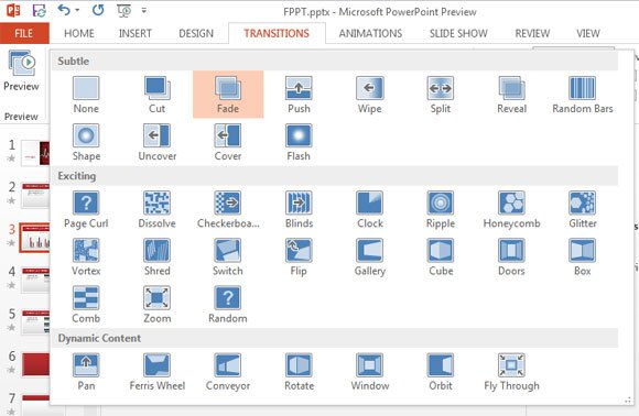
PowerPoint, as we all know is the best and the most popular tool to create presentations. Most of the PowerPoint users don’t give much priority transition effects and animations and they end up with some basic presentation with the texts wiping out of the screen or fading in/out throughout the presentation. What they fail to understand is people love eye-catchy elements. Transitions and Animations make your presentation more intuitive.
There are few key points that you need to consider while using transitions and animations efficiently in order to make your PowerPoint presentations more effective. Learn how to Add Transitions

Arrival Time of Transitions and Animation effects
Arrival time of transitional and animation effect is certainly the most important point to consider. Suppose, for example, you’re setting up a company logo with company name and a tagline beneath the logo. Now, what you need to care about is the time such as when to roll the logo image, when to fly transition the company text and tagline.
Animating Texts, Charts and Shapes
Charts and shapes are most likely choice for showing statistical information about any company. Whilst the text does an excellent job showing precise information at the right time, charts gives you an interface and information in simplest form.
Adding animations to text, charts and shapes
Adding an animation to text is very simple. All you’ve to do is use text box to enter your desired text and browse to animation tab. Just beside the preview button on top left corner, you’ll have the drop down option which will enable you to add animations to text.

To add a chart to PowerPoint presentation you can simply copy and paste from Excel and edit the animation in the similar way you did for text. You can Ungroup the chart for adding more integrated animation for each segment.
- Select an object
- Choose an animation
- Choose an effect
Transition Sound in PowerPoint
You can definitely add a sound to your transitions but practically it’s not recommended. When it comes to professional presentations, using sound in between the slides is not the feasible as it is considered as unprofessional and distracting. So, my recommendation would be – only use sound when you want to make it funny and interactive. Most precisely, sound will make presentation interactive if you’re going to present it to children.
Testing animation and transition effects
It’s always better to test out things before going for the final presentation. Ask your colleagues or friends what effects they feel are eye-catching and attention drawing. Test various animation and transition effects and try out few extra effects. If you wish to take transitions to the next level, be sure to check out Creating 3D transitions in PowerPoint.
