Simple Alternative to Bullet Points using Text Boxes

There are many possible alternatives to bullet lists in PowerPoint that will make your slides more catchy and impress the audience. However, maybe one of the simplest ways is to use text boxes in the slide instead of bullet points. You can use bullets to display important points easily read in the PowerPoint presentation slide. However, using too many bullet lists in a course or PowerPoint slide deck can be repetitious and mind-numbing.
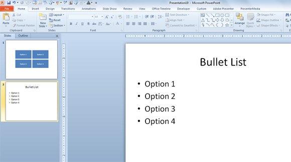
What to use instead of bullet points in PowerPoint? Here are some ideas:
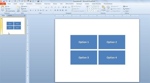
Here is an example of a PowerPoint slide that uses textboxes instead of Bullet Points and represent another way to display information.

This is another good way to display bullet lists instead of the classical bullet lists in PowerPoint.

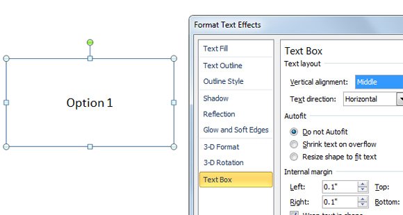
To achieve this design, you can start adding a textbox and then format it to display the text vertically (under text layout) and then change Do not autofit so you can change the height of the textbox.

Other Bullet List Creative Ideas for PowerPoint
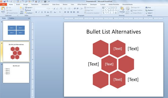
Other bullet list creative ideas for PowerPoint can be achieved using SmartArt graphics and other similar PowerPoint graphics. For example, the following image uses a creative layout as an alternative to bullet points, and it is easily created with SmartArt.

The alternating hexagon is another good approach using PowerPoint SmartArt. You can use the alternating hexagons in PowerPoint represent a series of interconnected ideas. Level 1 text appears inside the hexagons. Level 2 text appears outside the shapes.
Learners need creative ways to retain what they are looking and maintain the attention. The trick for going beyond bullets is to think visually instead of a list of text items. Using images can be another way to use bullet points effectively.
