How to Insert a Radar Chart in PowerPoint
Last updated on March 5th, 2024
Charts are very useful when we need to explain certain data to an audience and want to avoid full text paragraphs. By using charts we can follow the rules of an image showing more than thousand words. Here we will see how to insert a radar chart in PowerPoint.
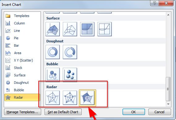
To create and insert a Radar Chart in PowerPoint first you need to open a blank presentation. Then go to Insert menu and click on Chart. Here you can choose the Chart Type before being inserted in the slide.

As you can see, there is a category Radar designed for this purpose. Here you can choose between three different radar charts in PowerPoint.
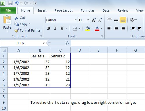
Now, an Excel spreadsheet will open where you can put your actual data or paste it from another Excel spreadsheet with your company information or market research.

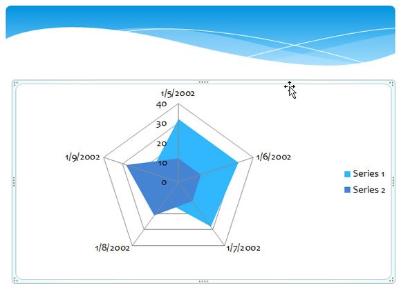
When you are done, close Excel and the chart will appear. Here is an example of the spider diagram created:

Examples of Radial Charts in Real-Life Situations
Radar charts are also known as Spider charts because the representation is like a web with a spider.
This kind of chart visually compares several entities (i.e., products, organizations, investment opportunities, people, etc.) on multiple dimensions at a time. It is widely used in Market Research but also in other sectors. Here are some examples on how you can use a spider diagram as a visualization in your presentations.
A manager may use it to create a diagnostic imaging (radiology) center and might want to compare her facility with the competition on dimensions related to patients, such as Time To Appointment, Report Turnaround Time, No Show Rate, and Wait Time.
Another good example is the one used by the website Versus.com, which allows to compare product features. In our experience, we tried comparing different motherboards and graphic cards (specifically we compared the GTX vs RTX).

Combined with other visualization tools like the Harvey Balls and spider chart templates for PowerPoint, you can make extraordinary presentations with visual data in the slides.
In this article, we explored how to create spider diagram in PowerPoint. Now, it is your time to create this diagram with your own data or use a different visualization chart to present your data to an audience.
