Punchcard Chart Templates for PowerPoint & Excel
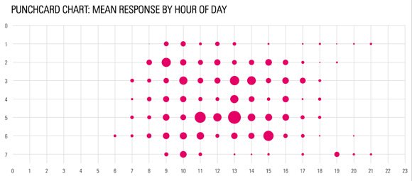
You can use Punchcard charts to help users visualize data by hour or day at the same time. A Punchcard chart may be useful for example to show the responses by hour of day. In the following example you can see the punchcard chart to show the mean response by hour of day and week, using the y-axis to show Sunday through Saturday.
This approach can be found in an Excel spreadsheet template showing how to make a Punchcard by Martin Hawksey (see the original post here).

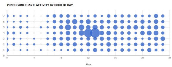
Another variant may show the activity by hour of day in a similar way.

The bubbles in this chart can help to understand the highest level of activity in a week/hour.
Punchcard Chart in Google Visualization API
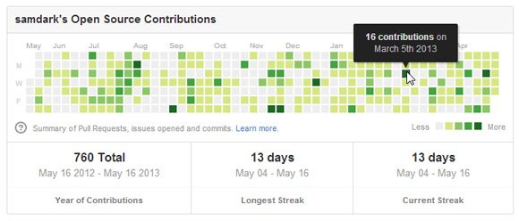
This is another example of Punchcard chart submitted to the gallery by Github and created using scatterplot.

Read the original web page here.
Bash History Punch Card Chart in GitHub
Punchcard graph on GitHub shows the hourly/daily/weekly output of a project in a nice and neat format with an awesome visualization that makes easier for anyone to understand what time of the week are the commits made.

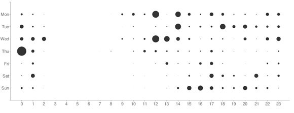
You can see another variant here:

Read the original article here.
If you are able to make an Excel chart using this Punchcard visualization tool then you can copy it to PowerPoint and show it in any presentation or slide design which makes a good idea to show events in a week and get the audience attention with a creative way to display data.
