Prezi vs PowerPoint – Which is Better?
So you have a hugely important presentation coming up and you want to leave a good impression on your audience. You want your presentation to genuinely wow your audience with jaw-dropping admiration, but you just have no idea which software to use: the traditional and comfortable PowerPoint or the newer, more unorthodox Prezi?

Which presentation tool are you going to use? Is one really better than the other? What are the perks and pitfalls of using Prezi over PowerPoint, or PowerPoint over Prezi?
In this article, we’re going to give you a rundown of the pros and cons of using PowerPoint and Prezi so you have a pretty good idea of which tool to use for whatever presentation project you may have.
PowerPoint: Your Easy, Standard, Go-To Software for Presentations
A trailblazer when it comes to presentation technology, PowerPoint has been around for decades. It’s like the father of all presentation software. So it’s no wonder that many people are easily experts, if not merely knowledgeable, of its navigation and features. The catch, however, is that a significant percentage of these PowerPoint users don’t have much design skills to really make the most of the software—so yes, there are tons of dull, unpolished, and mediocre decks going around.
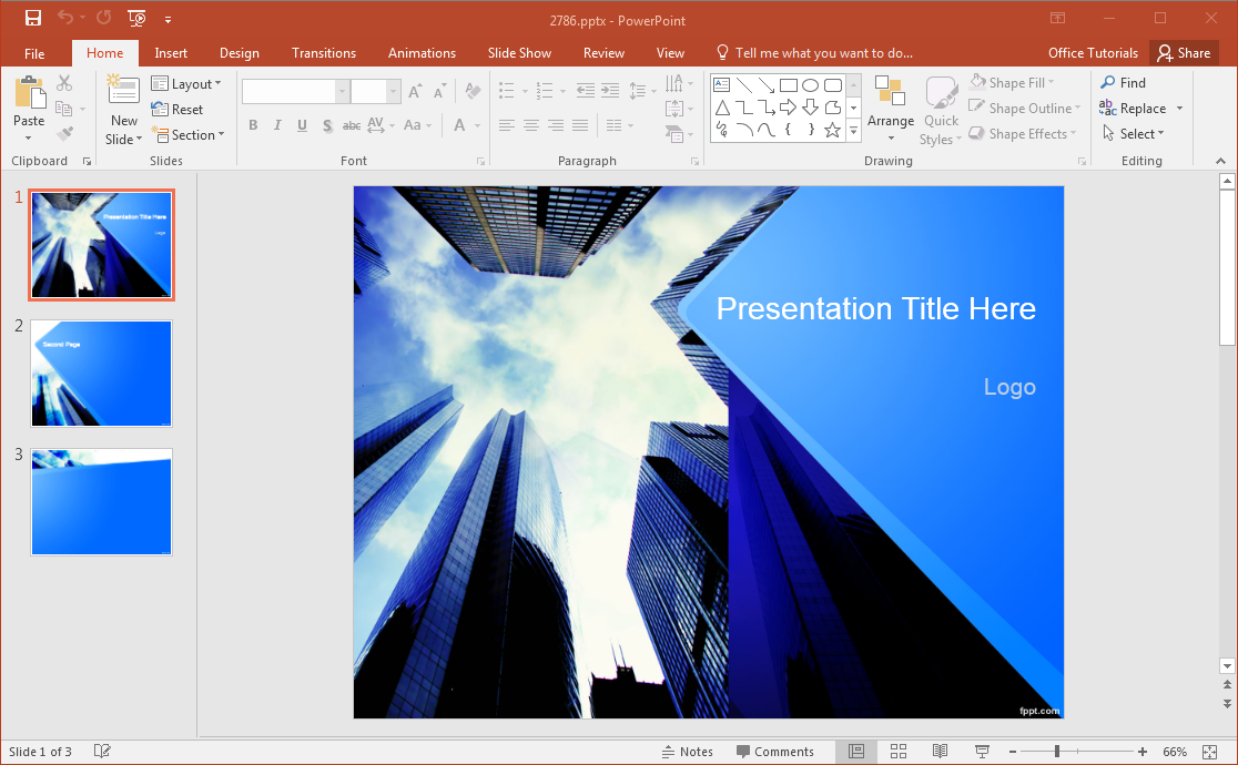
As it is, PowerPoint is user-friendly so it’s easy to play around with various slide components such as images, icons, visuals, text, shapes, effects, transitions, and animations. And if that’s not enough, you have an endless resource of free Microsoft PowerPoint templates right at your fingertips. Beyond the high-quality built-in templates from the software itself, there are many portals that offer templates for all sorts of presentation needs as well.

PowerPoint is also made up of slides for linear storytelling, a long-held tradition in presentations. You can create a chronological or progressive story from Slide 1 to Slide 2, and so on. Putting together data, figures, and statistics is also hassle-free, as these are simply inserted in your desired slides using a specific layout. And while there are predefined layouts in PowerPoint, you still have the liberty to put your creativity in the mix by creating your own layout using a blank slide.
Another great feature of PowerPoint, which Prezi doesn’t have, is the Notes pane. Here, you can include additional remarks and information on each slide. This serves as further reference for your audience. Then, you can print your slides as a handout, and even include the notes for good measure.
The downside to PowerPoint, however, is also its strength. Since it’s been around for quite a while, people will find your presentations predictable. Therefore, you have a tremendous challenge of coming up with hip and unpredictable slides, designs, animations, and transitions to truly add a sense of excitement to your deck.
Prezi: A Newer, More Dynamic Visual Aid Alternative
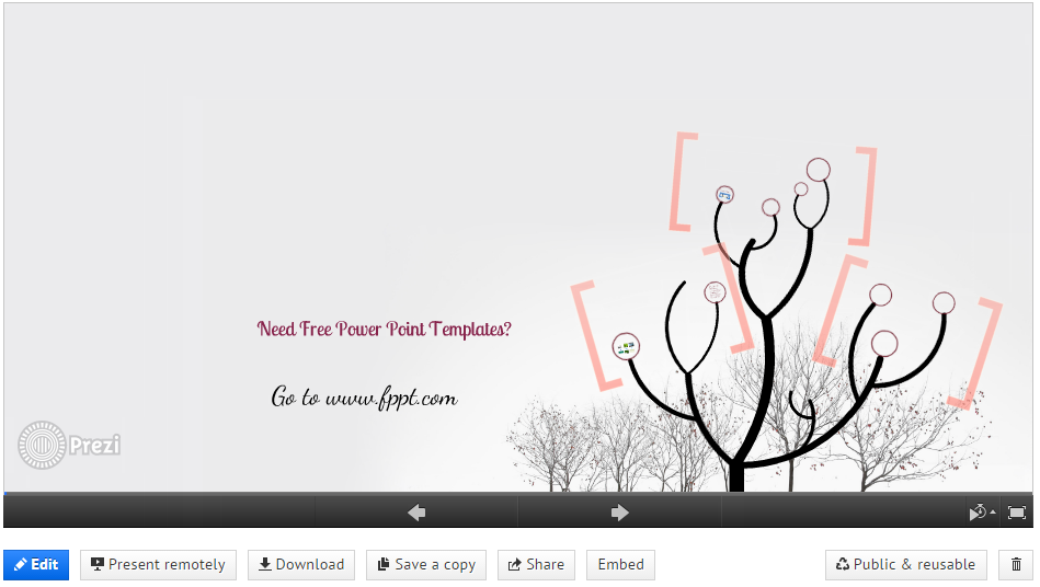
If PowerPoint has its foundation from slides, Prezi presentations take root from an unlimited, totally blank canvass. Carving out its own niche in presentation technology, the newer, non-linear Prezi uses a dynamic, flash-based map layout for presenting your ideas.
What’s great about Prezi is you don’t need to pack your gears and gadgets anywhere you go. Since everything is done online, you only need a Prezi login to show off your deck. This makes it easy for you to move anywhere geographically when presenting, as well as to create online seminars for a remote audience. Furthermore, remote collaboration is also easy, since everything is on the cloud and you can easily keep track of your presentation’s progress as it happens.

Because you’re working on an endless blank canvass, Prezi is perfect for dynamic storytelling, where you want your ideas to flow into each other. This gives you an equally endless possibility for creativity, which your audience will definitely appreciate as a breath of fresh air in meetings, seminars, conferences, and many other events.
Furthermore, audio narration and music import is easy, which is suitable for today’s times when technology makes it easy to view online classes and conferences. However, Prezi doesn’t have a printing option, a setback if you want your audience to have handouts for reference.
Its strength—animation and dynamic storytelling—can easily be its weakness. Many report becoming dizzy or having headaches trying to follow a Prezi presentation. As a presenter, you can easily lose control of navigating through a road map of ideas, especially when you have an information-heavy deck in your hands.
And while it’s free, you can only create Prezi presentations online. If you want to create one offline, you would need to buy the software, which may cost more than Microsoft PowerPoint and Office 365 subscriptions.
In terms of presentation templates, Prezi comes with a lot of presentation designs available, but when the time is short and you need to get work done, you can rely on PowerPoint templates and use Microsoft PowerPoint and its ease of use.
Final Verdict
So which is best when it comes to presentations? Well, it really is all up to you.
This comprehensive comparison between Prezi and PowerPoint tried to highlight the pros and cons of each tool. While PowerPoint is associated with the traditional and predictable, what people don’t realize is you can do a lot with PowerPoint to make it look streamlined and modern. Meanwhile, Prezi can be an out-of-the-box take on presentations that can pique the interest of your audience.
Still, knowing the strengths and weaknesses of both tools can help you choose which one is the best for whatever presentation project you may have on the slate. After all, it’s not so much as what program you use, but how you use it.
