10 of The Most Iconic Logos of Best Known Brands In The World
Last updated on November 8th, 2024
All of the most well-known brands in the world have one in common. They all have a specific identity, unique product or service, or brand image. Their logos specifically, convey a great message to their customers in terms of the brand’s values, norms, specialties, beliefs, and ultimately culture. People usually interact with your logos and brand symbols in the first place and this interaction leaves a great impact on the minds of the consumers as human psychology is directly related to what we see and observe and interact with on a daily basis. You can instill emotions, feelings, and an urge to perform a specific action in your audience through your recognizable logos. So to become one of the most recognized brands in the world, you need to develop the most influential logos.
The design, color, and graphics strategy make the logo worth seeing and appealing to the customers. If the color combination doesn’t match with the essence of the brand, then the people may get a wrong idea out of the brand symbols and ultimately you will lose a lot of conversions. That’s why hiring a professional designer who has sound knowledge of existing
major brand logos and the color strategy and human psychology will always be a good idea to start developing your own recognizable company logo.
Having the right logo for your brand identity and marketing is the need of the hour and you can’t simply neglect the importance of the visual elements in your overall business’s branding strategies. Market trends are always dynamic and ever-changing but the colors, layouts, and patterns may leave a great impact on your customers’ thoughts and perceptions. Hence knowing about the marketing and branding strategies of the world’s most recognizable brands is a great way to start building a logo that can be added to the list of well-known logos one day.
Following are some of the most popular logos in the world of some of the most globally recognized brands. They will give you a basic framework about your logo designing and future marketing strategies and how you can leverage the traits and characteristics of the most popular emblems to enrich your own brand and company’s stature.
1. Target Logo
Being one of the most recognized brands in the world in the retail industry, the famous American brand, Target has revolutionized the branding and marketing strategies in the world. Through proper R&D and consumer feedback, the target has been changing and updating its branding strategies throughout its history.
Historical Background
Target launched its first logo in 1962 and originally it had mainly three white and three red rings in its design with a bold text on the side mentioning the brand name. Later on, in a marketing campaign, they experimented with a new technique of advertising. In one of their advertisements, a woman was wearing earrings symbolic of Target’s logo. This was highly appreciated by the public but later on, the logo was changed entirely and all of the visual and graphical elements were removed from the symbol and only text remained in the logo describing the word “Target”. In 2006, the graphical element of the logo was incorporated again by removing the text. Now the original logo with the beautiful red and white rings still exists in its elegant form.
Target Logo Design Features
Target uses its logo to actually offer the symbolic representation of its brand name which is “Target”. Hence the picture of an actual target will be more suitable for a brand advocating the brand name entirely similar to it. In most logos of today, when we interact with some brand’s product, sometimes the brand’s logo is very complex with graphics and all colors combining to make a single symbol. The minimalist design of the target with a simple combination of red and white colors allows it to convey a simple and at the same time elegant vibe to its consumers. The circles in the symbol, are the signs of friendship and universality, and community building which is all very significant to Target.
In the business world, red represents the quality of passion, interest, and value. The white color shows simplicity, and cleanliness, and good fortune. Hence Target has clearly induced all of its brand’s visions, values, and morals in its logo through a smart selection of the colors and design elements becoming a member of the list of 10 most famous logos of the world.
2. Apple Logo
The multinational tech giant, Apple is one of the most well-known brands in the world. It provides products and services related to consumer electronics, computer softwares, and tools, and online services too. You must have heard the name of the iPhone, IPad, and IPods sometime in your life and this denotes the popularity level of the brand image.
Historical Background
Apple developed its first logo in 1976 and it was a lot different from its present form. Formerly it showed the picture of Newton sitting under a tree with an Apple hanging on his head ready to be dropped. The idea of the Apple logo was creative and well-known but later on, Apple further simplified the logo to a single apple, and ultimately by changing the colors of the logo gradually, we now have the existing form of one of the world’s best logos.
Apple Logo Design Features
Apple has changed its logo color from rainbow to chrome and now simply flat color but why?
Apple stands for variety, uniqueness, and stylishness. The black and chrome colors depict the elegance and variety in the logo and the curve of the Apple is a symbol of style in the brand’s main structure. The “bite” in apple is a symbol of the bite of the knowledge for customers that they get by using the products of Apple. Some people say that it is to honor Alan Turing regarding his contributions to the field of science and technology. The logo design of Apple completely reinforces the brand’s image and conveys the feelings of intelligence, innovation, and novelty to its consumers.
3. Google Logo
The famous, magnificent, and the king of all search engines, Google, is not a word that is unfamiliar to anyone. The multinational organization specializes in online and internet-based cloud services and products like web search engines, cloud computing, online advertising and marketing, softwares, and hardware at the same time.
Historical Background
Originally creating its logo in 1998, Google made only slight changes in its logo design until 2009. From 2009 till 2014, minor changes in the letter colors and spacing were made. In 2015, Google launched its ever vibrant and new logo with a customized typeface and modern and saturated colors making it look more elegant and fascinating. The current form of the logo is reminiscent of its 2015 version and is still one of the most famous logo symbols in the world.
Google Design Features
The design of the logo is very similar in terms of brand theme, accessibility publicly oriented to Apple and Target. Like other famous corporate logos, Google also uses a simple yet meaningful combination of colors in its design. It mainly uses primary colors in its design to give it a more vibrant look except for the letter “I” where it uses green color. This also shows that Google wants to move out of the rules in order to show a more coherent and diversified color combination visually appealing and inspiring at the same time. One of the most remarkable features of Google log is that the logo is usually changed with respect to every world event regarding its significance and importance for a specific culture and region. This makes Google’s logo one of the most recognizable logos in the world.
4. FedEx Logo
The famous American multinational corporation, FedEx specializes in eCommerce, transportation, and providing several types of business facilities to different companies worldwide.
Historical Background
The original logo of FedEx was produced in 1973 with a plain wordmark on a relatively patterned blue background. Then the logo went through different stages of color and typographical changes. Ultimately, in 1994, the logo was entirely changed with the purple and orange colors with a pure and prominent white arrow in between the last words of the logo.
FedEx Logo Design Features
The arrow in the design of the logo depicts the speed, precision, and to-the-point services which are the characteristics of well-known logistics and transportation brands. FedEx demonstrates each aspect of the company by introducing different colors like purple and orange colors are used for denoting the FedEx express which is a prime service for package sending and transportation.
5. LG Logo
Formerly known as Lucky-Goldstar, LG is a South Korean multinational tech corporation and is one of the largest companies in South Korea.
Historical Background
The logo was designed first in 1995 with the slogan “Life’s Good”. It remained unchanged until 2011 when I got changed entirely with a dashing 3D look glossy style of text that the company still uses today.
LG Logo Design Features
The winking Happy in the logo complements the company’s slogan which is “Life’s Good”. The word G is shaped like a button which is also a clever symbolism with any electronic product because they usually have buttons in their structure. The red circle is for friendship and endurance. The 3D aspect of the logo gives an idea of innovation and a sense of novelty to the brand’s image making it one of the most famous logos in the world.
6. Toyota Logo
One of the largest automobile manufacturers in the world, Toyota has become a symbol for cars and other automobiles. Whenever we hear the word Toyota, beautifully designed cars with excellent features come to mind. The Japanese brand produces more than 10 million vehicles per year.
Historical Background
The first logo was incorporated after a designing competition in 12936 and later it was changed to its present form in 1989.
Toyota Logo Design Features
As red is the color of unity and community in the business world, Toyota uses the red color as a primary component of its logo design. The silver and gray colors represent effectiveness, professionalism, and conventional safety. The curved edges are the symbol of dependability and uniqueness.
7. Mercedes-Benz Logo
The luxury vehicle manufacturing German company, Mercedes-Benz produces lavish vehicles for domestic and commercial use.
Historical Background
Most of the companies keep changing the design elements, colors, and overall structure of their logos but Mercedes-Benz is a symbol of persistence and continuity regarding its logo. They introduced a star in the logo in 1909 and are still a prime matter of focus in their logo to this date.
Mercedes-Benz Logo Design Features
The three prongs at the start of the logo represent the sea, air, and land. This is the vitality of the Mercedes. As many brands use specific text and other symbolic visuals in the logos, Mercedes Benz does not need to use specific graphics other than it already has as it has already developed a well-known brand image and whenever a customer or individual sees the logo, he/she may instantly recognize the brand identity. The Silver color is the symbol of conventional safety, professionalism with value, and ultimate dependability. The company outshines the crowd by making its logo thin and sharp as compared to other brands making it one of the top company logos in the world. This logo is widely recognized and one of the most popular logos, furthermore, the logo looks great in any printed meterial or even in presentations, also in a Mercedes Benz PowerPoint template.
8. Shell Logo
The famous oil and gas company, Shell, is also known as Royal Dutch Shell plc. The Company is headquartered in Hague, Netherland, and is operating worldwide by providing clean and efficient oil and gas-related energy sources to the global community.
Historical Background
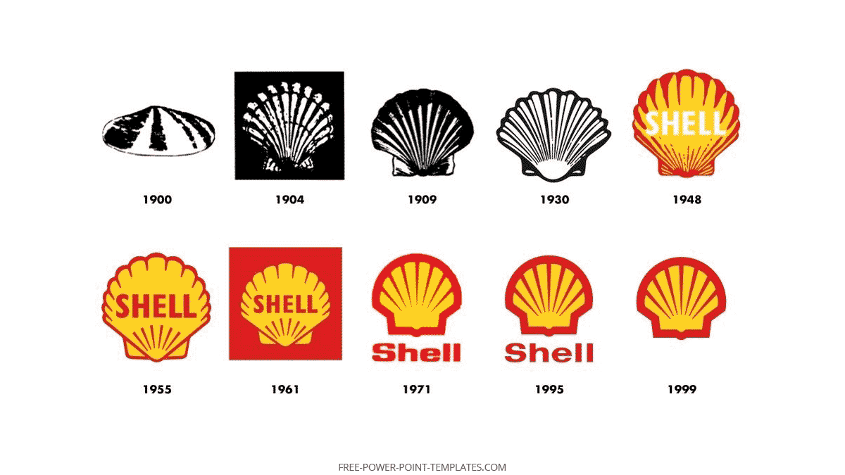
Currently known as the Oil and Gas conglomerate, Shell previously worked as a shell collecting company that brought shells from the sea to the western nations. Hence the drawing of a shell is justified. First, it had a black and white sketch of the shell in 1900, and in 1948, the company added color to its logo. The current logo appeared in 1995 which is still in usage and is without any text.
Design Features
The iconic yellow and red colors of the logo depict an affiliation with the deep-rooted love and affiliation of the company with its Spanish origin as it is to match its colors with the flag colors of Spain. The shell is the symbol of the background and root of the company’s trading past.
9. Coca-Cola Logo
The beverages giant, Coca-Cola is a familiar brand known to almost everyone. The multinational giant manufactures, distributes, and retails non-alcoholic beverages, syrups, and now even alcoholic beverages.
Historical Background
In 1886, the company first introduced the black and white logo. With the passage of time, the design of the logo has evolved but the script and writing style of the logo remained the same. In 1958, red and white colors were officially incorporated into the company’s logo.
Coca-Cola Logo Design Features
The fashionable and stylish writing script of the brand image shows the versatility, innovation, and elegant class of the brand. The brand symbols give a classic American look which gives goosebumps to the viewers giving them a glimpse of the elegant past of the region. The red color in the brand evokes excitement and passionate feelings. It also increases the urge and appetite of the consumer. That’s why the famous beverages brand uses a color combination similar and coherent to its brand’s image, theme, and philosophy. This excellent match allows Coca-Cola’s logo to become one of the most recognizable logos in the world.
10. Nike Logo
The American footwear, accessories, clothing, and services conglomerate, Nike is one of the most recognized brands in the world.
Historical Background
People recognize Nike through its swoosh but do you know how that swoosh was designed in the first place?
In 1971, a graphic design student Carolyn Davidson designed this amazing and famous logo for the owner of Nike for just 35$. Yes, you heard it right, only 35$. After that, the design and symbol is being used till today.
Nike Logo Design Features
The swoosh of the logo initially contained a text alongside the logo structure but with time, it was removed as the brand became one of the globally recognized brands and it didn’t even need to show the exact brand name along with the logo afterward. In Greek mythology, Nike is referred to as the Goddess of victory and hence the swoosh in the logo mimics the brand theme and name somehow. The black color is the sign of elegance, excellence, and inspiration and the swoosh sign gives it a touch of speed, power, and acceleration. This combination makes the consumer feel certain motivational emotions that Nike wants to instill in its customers. The swoosh is also a symbol of positivity. Hence Nike’s logo due to its flawless strategic similarity between its theme and design areas adds it to the list of top 10 recognized brands in the world.
Need to show the Nike Logo in a presentation? Learn how to recreate the Nike Logo in PowerPoint.
Final Words
The brand logos are the center of attention for customers as they define the values, norms, and ultimate brand specifications through their design and color combinations.
Various brands use different combinations of graphics and visuals while some of them use simple text or colors in their design to depict simplicity and elegance at the same time. Different symbols and visuals convey varying meanings which are perfectly used by all the major brands relating them to their brand values and norms. Famous brands justify their superiority over others using symbols, signs, and colors that are metaphorical to their vision, mission, products, and services. All major brands like Nike, Google, Apple, and Coca-Cola are the guiding principles for new and upcoming brands to enhance their branding and marketing strategies.
We will send you our curated collections to your email weekly. No spam, promise!
