Make a Chart in PowerPoint and Excel
Last updated on October 4th, 2024
We’ve explored creating several kinds of charts in PowerPoint in previous tutorials. We’ve also created a chart and edited it accordingly. Now, we will create a chart in Excel and later explain the advantages of using Excel and PowerPoint, their strengths and weaknesses in areas.
Creating a chart in Excel is a very straightforward task. You don’t have to worry about making a background or stylizing anything actually since Excel is purely for storing stats and figures. To start, you want to have your data ready and organized.
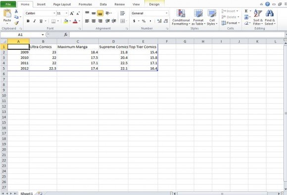
Next select the data only in the rows with headings. This means data with some form of text in the first row. Click on the Insert tab and select Column.
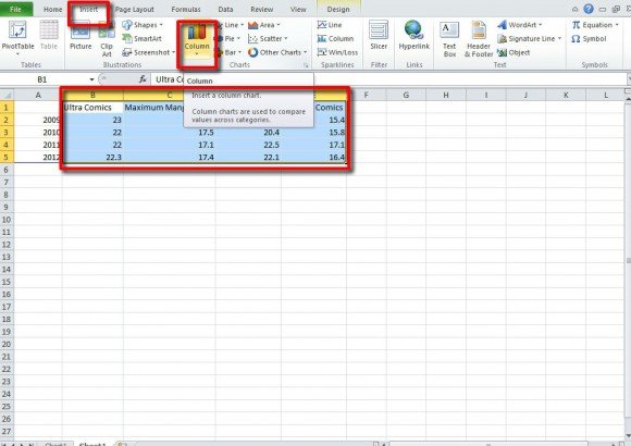
In the drop down, there will be several familiar charts. For this tutorial we selected the 3D Clustered Column chart.
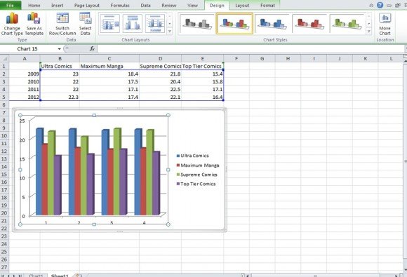
With this chart in the spreadsheet, you’ll notice that Chart Tools from PowerPoint has appeared. This allows you to do all the design tasks from PowerPoint based charts in Excel. All that is left to do now is edit the category line beneath the charts. In the example above it reads “1,2,3,4” we want it to read the years.
Select your chart and click Design. You will see Select Data in this row.
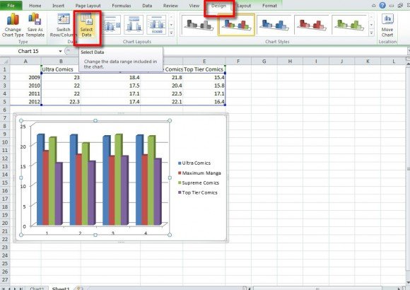
Next, you will go to the right box for categories.
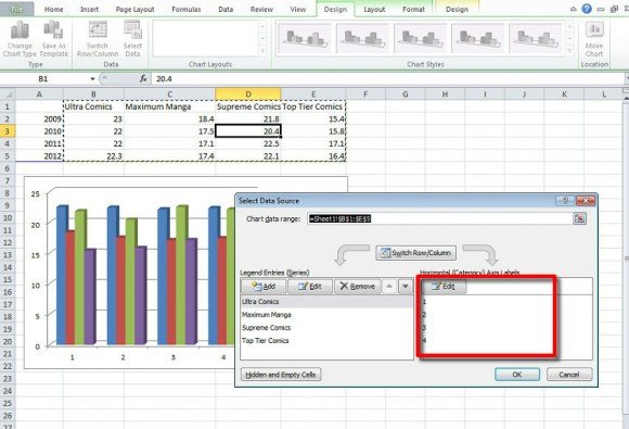
Click edit and add the years sequence or the categories for your chart. Be sure to separate them with commas. Once done, click OK or press Enter.
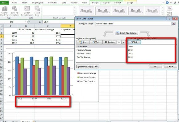
In the above example shown, you have corrected the numbering or categories for your excel chart and the chart is completed.
In PowerPoint and Excel you are able to make a variety of charts. The question of “Why make a chart in that application when I can do it in this one” might come up.
Excel is better used for collecting and storing a great deal of stats across many spreadsheets. If you make a chart in Excel it’s more than likely going to be used either personally to see how data stacks up or for others in a work group to see the data. You wouldn’t use Excel for a presentation because it’s not “easy on the eyes”. It’s graphs, lines, and mainly meant for personal work.
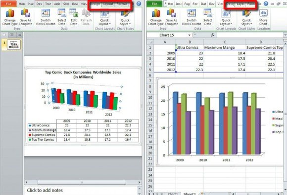
With PowerPoint, it works hand in hand with Excel. If you are going to make a bar graph or line chart, Excel will open automatically and you handle inputting data there. PowerPoint is better used for the presentation side of what you have done in Excel. While they share some similar features for chart creation, PowerPoint is all about show—background, graphics, sounds, and other things that you simply can’t do in Excel even if you were presenting Excel on a projector. Also as software based on presentations, you can either narrate slides or have it run on its own with a voice over.
In short, you will use Excel on its own as a means to compile and store stats and date and in tandem with PowerPoint as the origin of data when it comes to creating charts for presentations.
