Kano Model Diagram in PowerPoint using Shapes
Last updated on April 22nd, 2024
The Kano model is a very popular model named after Noriaki Kano. It is used for classifying customer preferences based on five categories. Sometimes you may need to prepare a a PowerPoint presentation showing the Kano model in the slide designs. In this article we will review how to draw a Kano model diagram in PowerPoint using just PowerPoint as the editor. If you want to know more on what is Kano Model and how it is used as an analysis framework, then you can learn more on Kano Model here.
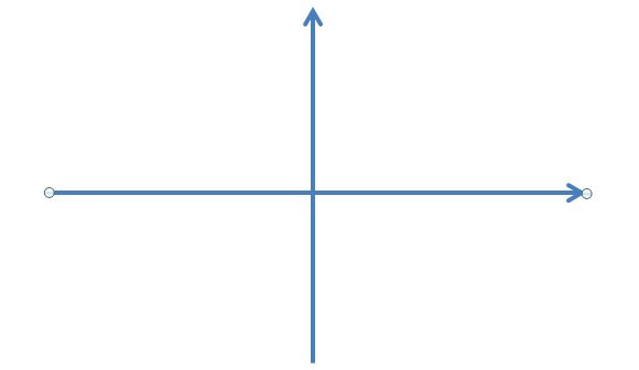
In PowerPoint we can draw a Kano Model diagram using shapes. First, we start creating the 2D coordinates system as follows.

We can use simple line shapes to draw the vertical and horizontal axis.

Kano Model helps in the synthesis of user research and get better client communication, help to improve the user experience design process and interactively design a product. This model can help to prioritize features in the product development process, better trade-off decisions to achieve the success in implementation and differentiation. You can also use Kano Model to target different personas.
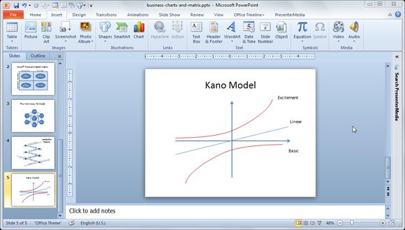
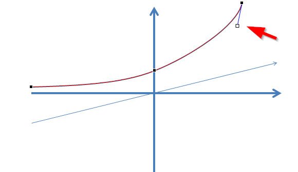
In PowerPoint you can start drawing the linear curve and then use the curved shape to draw the top curve and bottom curve. The top curve is the Excitement or differentiation curve while the bottom curve is the Basic or Cost of Entry curve.

For the bottom curve, you can just duplicate the top curve shape using the Duplicate feature in PowerPoint.

Then you can flip vertical and horizontal to get the bottom curve.

Finally, we get a design like the following image and you can change the line weight and color to get the final Kano Model diagram for PowerPoint presentations. Now you can use this design to make your own Kano Model PowerPoint templates for free.

Here is an example of PowerPoint presentation using Kano Model PPT.

