How to Make Histograms in PowerPoint using Excel Charts
Last updated on September 4th, 2025
Using Excel and the free Analysis Toolpak add-in for Excel, you can create useful histograms for your spreadsheets, but also use the resulting image to copy and paste the Histogram in PowerPoint presentations. Here we will show you how to make histogram charts for PowerPoint using Excel.
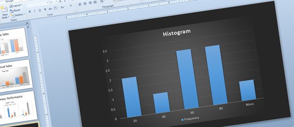
Here we will show you how to create a histogram chart in Excel and then use it in PowerPoint for your presentations. Finally, we will see how to apply the styles available in PowerPoint charts to make it impressive using the modern PowerPoint chart templates in PowerPoint.
Quickest Way to Insert Histogram in PowerPoint
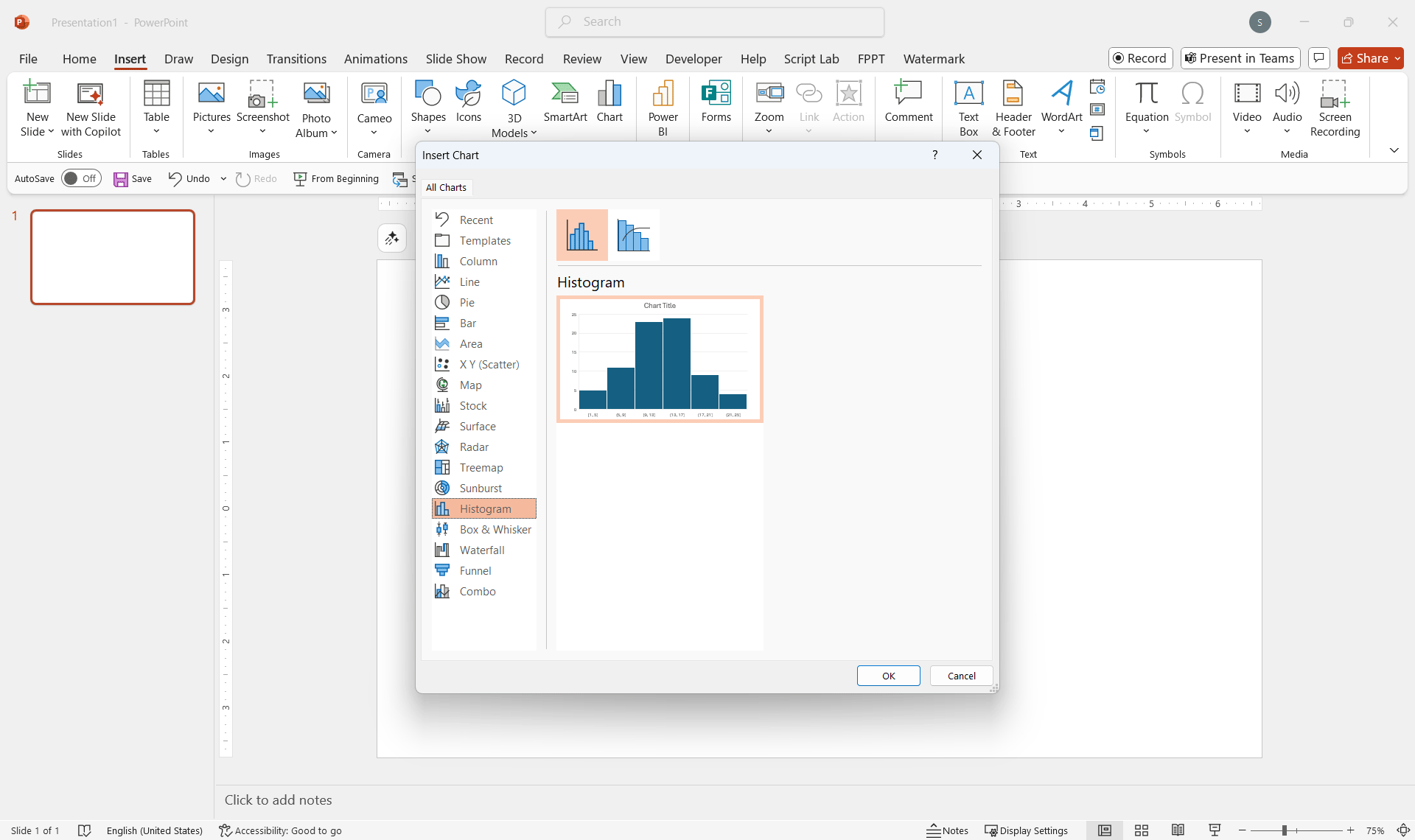
Go to insert a Chart, and pick Histogram chart.
Then, enter the data in the spreadsheet.
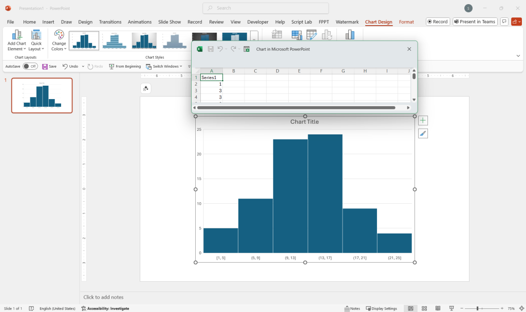
Finally, you can apply colors or styles to match your presentation.
Create a Histogram in Excel
Alternatively, you can create a Histogram in Microsoft Excel using a similar approach, or install a 3rd. Party add-in named Analysis Toolpak. This is particularly useful if you are using an old version of Microsoft Office, not supporting Histogram chart.
Analysis ToolPak is an add-in for Microsoft Excel. Analysis ToolPak VBA is another variant that can be used with Macros, while the Analysis ToolPak is for interactive use. This add-in is great to add new analysis features for Excel spreadsheets, under the Data Analysis button in the menu making possible to run analysis and generate new charts for statistics and other useful applications including: Anova: Single Factor, Anova: Two-Factor with Replication, Anova: Two-Factor, Without Replication, Correlation, Covariance, Descriptive Statistics, Exponential Smoothing, F-Test Two Sample for Variance, Fourier Analysis, Histogram, Moving Average, Random Number Generation, Rank and Percents, Regression, Sampling, t-Test: Paired Two Sample for Means.
Go to Excel options and then choose Add-ins. Look for the combo box at the bottom and click Manage Excel Add-ins and Go button.
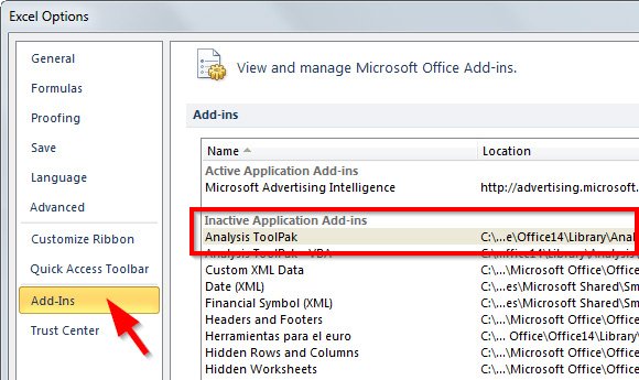
Now, check the Analysis ToolPak option and then click OK.
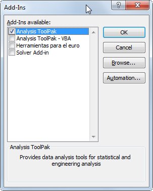
Now, you can insert a sample table or data with the data and bins.
The first column is the input data and the second one are the bins.
| 87 | 20 |
| 27 | 40 |
| 45 | 60 |
| 62 | 80 |
| 3 | |
| 52 | |
| 20 | |
| 43 | |
| 74 | |
| 61 |
Now look for the Data Analysis button in Excel, that should appear under Data menu. Here we will create a Histogram in Excel.
Tip: If you already have the frequency in the tabular data, then you can easily create a Histogram using the simple Bar chart in Excel or PowerPoint.
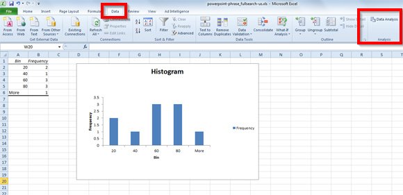
In the Data Analysis dialog, under Analysis Tools choose Histogram from the list and click OK.
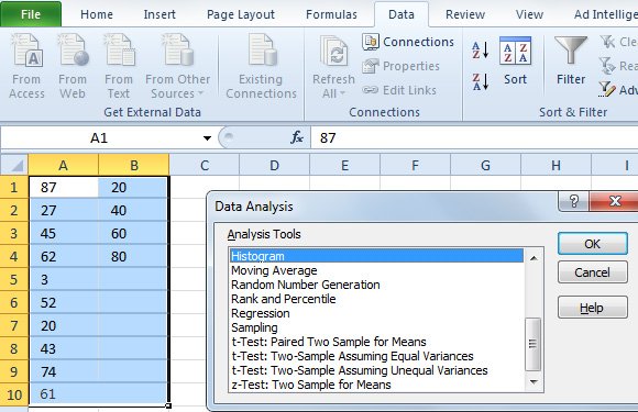
Now, select the input range with the data on the first column and then the bin range with the second column.
Make sure to check the Chart Output since this will indicate that we want to generate the chart. You can also use cumulative percentage or the Pareto style (sorted histogram).
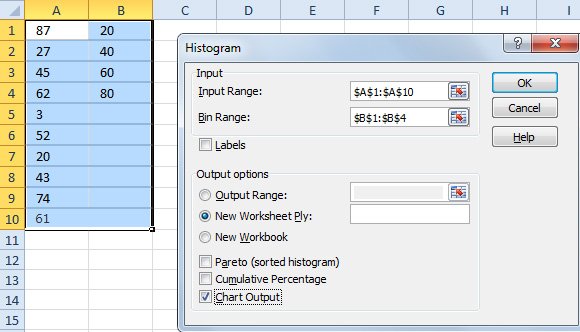
Click OK and now we will see the Histogram chart in Excel.
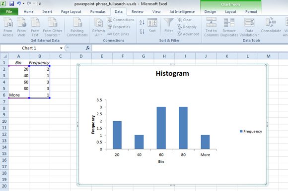
Now with the chart we have created in Excel we are ready to use it for our PowerPoint presentations or PowerPoint templates.
Analysis Toolpak is a powerful add-in that most people may not be aware of, and allows you to use Excel as a statistical or engineering platform for analysis. In fact, to use these tools you need to be familiar with the specific area of statistics or engineering that you want to develop analyses for. You can learn more about Analysis Toolpak and Excel functions in this website.
How to Create the Histogram Chart in PowerPoint
Now that we have seen how to make an histogram in Excel, let’s move forward and learn how to make Histogram in PowerPoint with the chart created in Excel.
Copy the chart from Excel and paste it in a new slide in PowerPoint. You will see that the chart looks exactly the same, moreover you can also see the Chart Tools on the top of PowerPoint ribbon. Here you can customize the chart design, format it or change the chart layout.
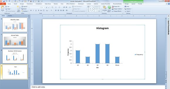
This is our histogram sample in PowerPoint, however we can move a step forward and change the styling. For example, we may want to modernize the style by using one of the chart templates available in Microsoft PowerPoint. Apply any chart template and then you can make your Histogram look really awesome and modern.
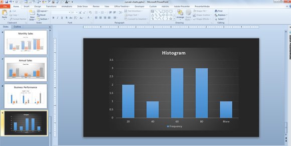
It is important to notice that you can also copy and paste the chart as an image, using Paste Special.
More about Histograms and Charts
As you can see, the difference between histogram and bar chart is just about the input data and frequency count. In the histogram,
Normally in Histograms there is no gap between the columns. You can do that in PowerPoint if you really need to remove the gap. For this purpose, you can access the Format Data Serie dialog and then look for the Gap Width option. Choose No Gap on the left or 0% gap and it will remove the space between the bar chart in PowerPoint histogram.
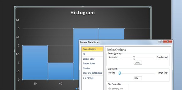
If you need to use this similar chart template we have saved the .crtx chart template for your convenience and you can download it here. This chart template is compatible with Microsoft Excel and Microsoft PowerPoint.
Histogram Chart Template (1768 downloads )Alternatively to this solution you may want to check the free histogram online generators as well as other solutions for example to design your own histogram manually using shapes in PowerPoint. However, this may not be a good solution if you are looking for an accurate solution. Finally, if you need to update the histogram chart automatically from the data that you change in Excel then you can learn more in how to update automatically the chart from Excel into PowerPoint.
