How to Make a Quad Chart in PowerPoint
Last updated on October 13th, 2025
Quad charts are a highly effective tool for presenting complex information in a visually appealing and easily digestible format. These charts divide data into four distinct quadrants, allowing you to convey multiple ideas or datasets in a single slide. Used across various industries, from business and marketing to research and education, quad charts can help engage your audience and communicate your message with clarity and precision.
In this article, we will delve into the importance of quad charts in presentations, explore the concept of quadrants on a graph, and provide a step-by-step guide on how to create an impactful quad chart in PowerPoint. Additionally, we will share tips for using quad charts effectively in presentations and showcase examples of successful quad chart applications. By the end of this article, you will be equipped with the knowledge and skills to create captivating quad charts that elevate your presentations to the next level.
What are Quad Charts?
Before diving into the creation of a quad chart in PowerPoint, it is essential to understand the basic concept of quadrants on a graph. This foundational knowledge will enable you to effectively leverage the power of quad charts in your presentations.
Definition of quadrants
Quadrants are the four sections created when a graph is divided by a horizontal (x) axis and a vertical (y) axis. These axes intersect at the origin (0,0), and the graph is split into four equal parts called quadrants, numbered counterclockwise from the top right:
- Quadrant I: Positive x and positive y values
- Quadrant II: Negative x and positive y values
- Quadrant III: Negative x and negative y values
- Quadrant IV: Positive x and negative y values
The significance of each quadrant
Each quadrant has its own unique characteristics, which can be used to represent different types of data or information. By associating certain qualities or themes with each quadrant, you can create a cohesive and organized presentation of complex information. For example, a SWOT analysis can be mapped onto a quad chart, with each quadrant representing one of the four components: strengths, weaknesses, opportunities, and threats.
Examples of data represented in quadrants
Quadrants can be used to represent various types of data, such as:
- Numerical data: In a scatter plot, data points can be plotted in different quadrants to reveal patterns, trends, or relationships between variables.
- Categorical data: Each quadrant can represent a category, such as product types, customer segments, or project stages.
- Qualitative data: Quadrants can be used to showcase qualitative aspects of your subject matter, such as opinions, sentiments, or priorities.
Understanding the concept of quadrants on a graph is crucial to making the most of quad charts in your PowerPoint presentations. In the next section, we will guide you through the process of creating a quad chart in PowerPoint to convey your information effectively.
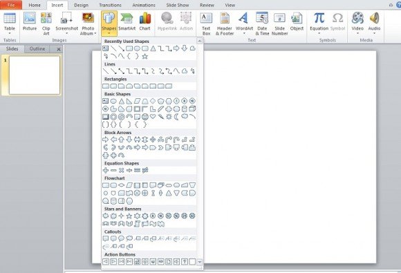
Simply divide the slide into quadrants. Leave space at the top for header, but essentially you only need two lines. For this tutorial, we’re adding a third to separate the header from the actual quad chart. We suggest that you select all of the lines and group them.

Basically, you just made the quad chart. All that is left is for you to insert your created graphs, imagines, bullet points, etc. The content you will put in is totally up to what you need to express through your chart.
As you can see, you can put whatever you would like in the quadrants and make each. It’s an issue of resizing your content to fit the quadrants.
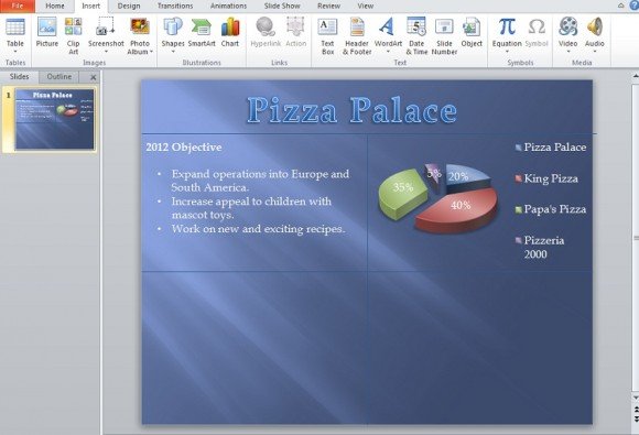
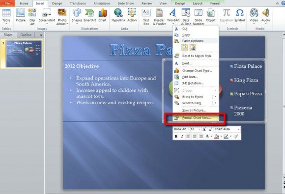
In the case of individual charts, you can even give it its own background thanks to the presets. Either before resizing the chart or after resizing it; right click on the outer border of the chart then select Format Chart Area.
From here, it will appear on Fill at default. Click on one of the radio buttons and edit the option as desired.
Alternatively you can download other free quad charts for PowerPoint or matrix tables.
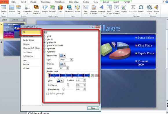
Essentially, you have given that particular piece of content its own background on the greater PowerPoint quad chart with its own background.
To save time on doing a background for content that is just text, click on the Insert tab and Shapes once again and select rectangle. Resize it to the shape of a quadrant and drag it in place. Right click on it and select Send to Back and then Send Backward.

Now right click once again and select Format Shape at the very bottom of the drop down. We’re at Fill again and we’ll do the same thing we did for the chart that was inserted earlier.
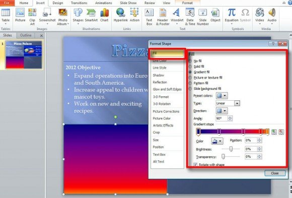
Now, you can place whatever text you wish on top of the square, currently serving as the concept of quadrants on a graph with their backgrounds.
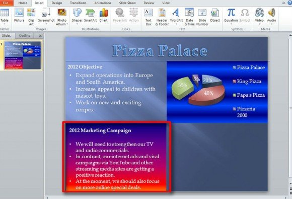
As stated the content to actually put in the quad chart depends on what you want or feel is needed in the PowerPoint presentation, so there is no definitive format to follow as far as structure, theme, or design.
We suggest that you save your created quad chart as a template for future use. The main background can be edited as can the color and thickness of the lines that make quadrants for your PowerPoint quad chart.
Tips for Using Quad Charts in Presentations
Creating a visually appealing and effective quad chart is just the beginning. To make the most of quad charts in your presentations, follow these tips for enhanced clarity, readability, and audience engagement.
1. Balancing content in each quadrant
One of the primary benefits of quad charts is their ability to present information in a balanced and organized manner. To achieve this, ensure that the content in each quadrant is evenly distributed and consistent in terms of the amount of information, visual elements, and text size. Unless you use asymmetrical balance technique in your presentations, Avoid overloading one quadrant with too much data, as this can make your chart difficult to read and comprehend.
2. Ensuring clarity and readability
To maximize the impact of your quad chart, prioritize clarity and readability. Choose fonts, colors, and graphical elements that are easy to read and visually appealing. Maintain a consistent font size and style throughout the chart, and use contrasting colors for text and background to ensure legibility. Additionally, avoid cluttering the chart with unnecessary details or decorations that may detract from the main message.
3. Using animations and transitions effectively
Animations and transitions in PowerPoint can enhance your quad chart presentation by guiding your audience’s attention and emphasizing key points. However, overusing these features can be distracting and counterproductive. Use animations and transitions sparingly, and opt for simple, clean effects that complement the content of your chart without overshadowing it.
By following these tips for using quad charts in presentations, you can create an engaging and informative visual aid that effectively communicates your message and captures your audience’s attention. In the next section, we will provide examples of successful quad chart applications in various presentation contexts to inspire your own creative use of this versatile tool.
Conclusions
You can use this technique to make awesome but simple quad chart in PowerPoint to be used in your PowerPoint templates and .ppt presentations, you can also use them in conjunction with Graphic organizer templates for your presentations.
