How to Make an Editable Doughnut Chart in PowerPoint
A doughnut chart displays value data as percentages of the whole and is a chart format available for use in Microsoft PowerPoint. Individual slices represent categories. Doughnut charts are functionally identical to pie charts because you can display almost the same data. There are two types of doughnut charts: doughnut and exploded doughnut.
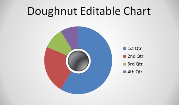
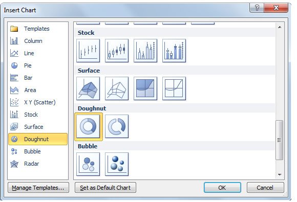
The basic way to create a doughnut chart is by using the gallery when inserting a chart.
Go to Insert -> Chart and then choose Doughnut from the list.
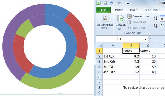
Now you can customize the chart by adding data in the spreadsheet. If you need to add a new data series with a concentric circle in the chart, you can add a new column to the sample data in the spreadsheet.
Another way to make a Doughnut Chart in PowerPoint
Here is another basic way to add a chart doughnut chart in PowerPoint from a simple pie chart.
We start creating a simple pie chart in PowerPoint. A basic pie chart in PowerPoint can be inserted by using the chart gallery.
Configure the pie chart to display the data you wish to. Then, add a simple circle in the center of the pie chart.
Now, repeat the process and add a secondary concentric circle in the center of the first circle shape that you added.
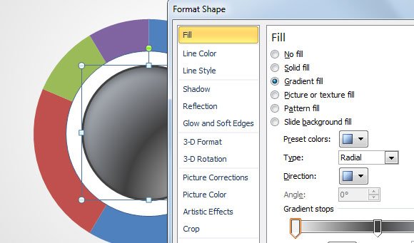
Now, let’s fill the first shape with a white background and the second shape (the internal one) with a nice background style. You can use gradients, for example the radial gradient style plus a nice shadow effect.
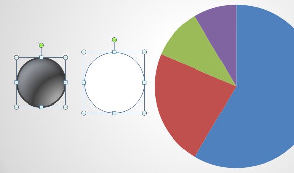
Here you have the isolated elements that we will use to compose the doughnut chart. The two circled shapes and the pie chart.

You can customize the internal circle by changing the Format Shape properties.
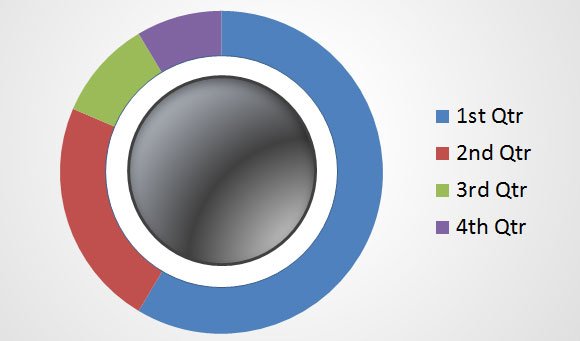
Finally, our editable doughnut chart will look like this.
You can learn more about how to present your data in a doughnut chart, download donut chart templates or you can download free PowerPoint and chart templates. If you need this doughtnut chart template feel free to ask us, we can kindly send it to you.
