14+ Effective Tips on How to Make a Good Presentation (Tips, Examples & Templates)
Last updated on September 18th, 2024
Creating and executing an effective presentation takes practice. Not everyone is born a natural presenter and needs the right direction to present effectively and create a good-looking presentation that will awe the audience.
Whether it’s a pitch for a new product idea, a presentation for a marketing report, an industry conference, or any other, this ultimate guide on how to make a good presentation will help you out.
How to Make an Effective PowerPoint Presentation?
There are multiple ways to make a presentation in PowerPoint. Let’s dive in on how to create a PowerPoint presentation (in a few steps).
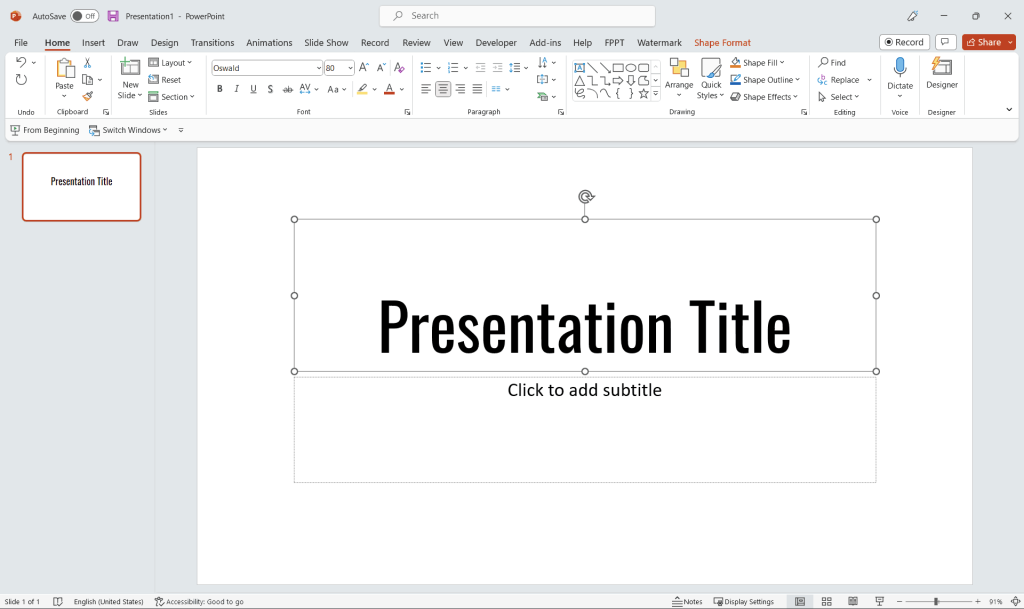
Open PowerPoint
Start by opening PowerPoint on your computer. You’ll see a variety of presentation templates to choose from, or you can select the “Blank Presentation” option to start from scratch, like the image above. If you opt for a blank presentation, you can still use a presentation template by SlideModel.
Create a title slide
The first slide in your presentation is the title slide, which introduces your topic and sets the tone for the rest of the presentation. Click on the “Insert” tab, then click on “Text Box” to create a text box for your title. Customize the font, size, and color to make your title stand out.
Add new slides to your presentation
To add a new slide, click on the “Home” tab, and then click on the “New Slide” button. You can choose from various layout options, including content with a caption, comparison, or blank. Each layout serves a different purpose and can be customized to fit your content.
Organize your content
Plan the flow of your presentation by outlining the main points you want to cover. Arrange your slides in a logical order that tells a clear story. Use bullet points or short phrases to convey your ideas, and avoid including too much text on a single slide. Learn how to organize a PowerPoint presentation, or if you need to change the color of bullet points, refer to our alternative article.
Insert visual elements
Visuals are crucial in making your presentation engaging and memorable. Click on the “Insert” tab to add images, charts, tables, or other visual elements that support your content. Make sure the visuals are relevant, high-quality, and properly attributed if necessary. Alternatively, you can add visual slides from 3rd. party websites, such as SlideModel.
Apply design themes and animations
To give your presentation a cohesive look, apply a design theme. Click on the “Design” tab and choose from the available themes. You can also customize the theme colors, fonts, and effects to match your branding or preferences. Add animations and transitions between slides by clicking on the “Animations” and “Transitions” tabs, but use them sparingly to avoid distractions.
Proofread and practice
Before presenting, proofread your slides to check for typos, inconsistencies, and clarity. Make sure the content is well-structured and easy to understand. Practice your presentation to become familiar with the flow, timing, and delivery of your content.
By following these steps, you can create a PowerPoint presentation from scratch that is engaging, informative, and visually appealing. Remember, when creating a PowerPoint presentation, to keep your audience in mind and use visuals, concise text, and a clear structure to effectively convey your message.
Tips on How to Make a Good Presentation
In this section, we outline some presenting tips for PowerPoint presentations, including how to make a presentation effective and ensure that your audience takes away the message you intend to deliver. Let’s see how to create a presentation that looks great.
1. Develop an Easy-to-Follow Presentation Structure
An effective presentation needs to be broken down into an easy-to-follow structure for the audience to be able to grasp the core idea or message you want to deliver. The three simple sections for an effective presentation outline can be:
A. Prepare a Captivating Introduction
The introduction should be a brief summary of what the presentation entails, why it is relevant for the audience, and what gives you the authority to speak on the topic. When you start a presentation, highlight your expertise or qualification here to determine your credibility.
B. Body of Evidence
Next is the body of evidence, where you can highlight the importance or purpose of your presentation via quotes, facts, research-based evidence, and statistics in your field. Here you highlight your main points and provide evidence to back them up so the audience can relate to and grasp the importance of your presentation. Where can you find content for the body of evidence? There are plenty of online resources from which you can grab useful statistics, let’s say for example you are preparing a marketing presentation, you can run a search for best marketing statistics you need to know. Of course, make sure to find relevant and credible sources.
C. Key Takeaways
In the end, make sure to highlight your presentation’s key takeaways, so the audience knows what action to take moving forward. They should be able to put what they learned from your presentation into practice for it to be an effective presentation. A key takeaways slide can be used to end a presentation.
2. Simple Layout & Design Details
The visual presentation design should be simple yet effective so that it stands out without overwhelming the audience. A good design should be able to deliver the core message of the presentation without complicating it. In cases like this, apply KISS principle & make the presentation concise.
A. Moderate Use of Colors
Using colors is important for a visual presentation, and an effective presentation must have a moderate yet cohesive color scheme to complement the design, impress the audience and deliver the message effectively. Choosing a one-to-two color palette will greatly enhance the visual presentation appearance and make it have a consistent brand look and feel.
B. Font Consistency
A consistent font throughout the presentation not only makes it effective but also makes it professional. Keep consistent caps, font size, and style throughout the presentation to make the design uniform and deliver the presentation effectively.

C. Formatting
Formatting plays a crucial role when it comes to making an effective presentation. Having a rough format with graphics not properly aligned makes it seem unprofessional and will look bad to the audience. So, for an effective presentation, it is important that all text and graphics are aligned neatly, without any misalignment.
D. Visuals to Support
Adding visuals to support your statements will provide the audience with a more cohesive take on your main message. Too much text without any supporting visuals will make your presentation boring. Therefore, add different forms of media, charts, graphs, and other visuals to deliver your main points effectively and leave a lasting impact on the audience. Making a visual presentation can help to wow the audience and convey a message effectively.
3. Limited Copy on Each Slide
When it comes to the written text on each slide, you really want to focus on keeping only the important stuff. An effective presentation is to the point, with limited copy on each slide. Excessive text will lead the audience to focus and start reading what’s on the slides rather than listening to what you are presenting. The focus of the audience should be on what you are saying, and they should be left with the emotional impact of your message for it to be an effective presentation.
A. Few Words Per Slide
A famous marketer, Seth Godin, talks about presentations and states that each slide should have just 6 words per slide. A presenter should choose limited words to add per slide and keep more for the talk to keep the audience engaged throughout the presentation.

Alternatively, you can rely on the Takahashi method. It is a technique deploying distilled and simple visual slides for preparing your presentations.
It is pretty similar to another method with the name Lessig method, which was originally created by Lawrence Lessig, a Harvard professor and former presidential candidate. In this presentation technique, Lessig synchronizes the slides being presented with the speech.
B. 10-20-30 Rule
Another popular presentation rule is the 10-20-30 rule introduced by former Apple Brand Ambassador Guy Kawasaki. According to it, an effective PowerPoint Presentation should have only 10 slides; it must not be longer than 20 minutes and have a font size of at least 30. Following this strategy, one can make sure to create an effective presentation and deliver it smoothly.
C. Facts and Figures to Support Statements
Use relevant facts and figures to support your statements and establish your authority on the matter while presenting. Facts and figures are necessary for the audience to relate statements to real life without them being confused about what you are presenting. So, make sure to add relevant facts and figures where necessary to make your presentation effective.
D. Apply the 5/5/5 Rule for presentations
The 5-5-5 rule for presentations is a guideline that helps structure presentations to make them more effective and engaging. Here is how the 5-5-5 rule for presentations work.
- 5 minutes: Each section of your presentation should take about 5 minutes to present. This principle is based on the idea that the average person’s attention span tends to wane after about 5 minutes of listening to the same topic.
- 5 points: Each section of your presentation should contain no more than 5 main points. This keeps the information manageable and easy to follow for your audience. It also helps to ensure that you stay focused on your most important messages.
- 5 words: Each slide should have no more than 5 words per line, and ideally, you should use images wherever possible. This keeps your slides from becoming cluttered and helps maintain the audience’s attention.
These rules aren’t hard and fast, and depending on the nature of your presentation, they can be adjusted. For instance, in some academic or technical presentations, it might be necessary to go into more detail and thus deviate from the 5-5-5 rule. But in general, this rule is a helpful guide for keeping your presentations clear, concise, and engaging.
4. Edit and Finalize
A great presentation is not about just putting up some slides; it’s all about designing, which makes it effective. You must give the editing and finalization process considerable thought if you want to grab the interest of your audience effectively. Here are some suggestions for improving the effectiveness of your presentation:
- Ensure that your slides are ordered and simple to understand.
- Remove any useless information.
- Use compelling images to support your arguments.
- To prevent startling your audience, use transitions sparingly.
- Make sure you deliver your presentation smoothly by practicing it multiple times.
A. Polish Several Times
You should start editing and proofreading your presentation as soon as you have a rough copy. Utilizing free grammar and spell-checking software is a useful writing tip. They frequently discover things that you may have never even noticed or seen. It gets simpler for you to start noticing extraneous content on your slides once you’ve seen your presentation a few times.
You can reduce your language and words into core points and concepts to make your presentations more aesthetically beautiful and visually clear. This will increase the amount of negative space in your slide and improve its aesthetics.
Don’t just give your presentation a cursory once-over and call it a day. Make sure your presentation is flawless by reviewing it a second, third, and even fourth time. Ask someone else to look over your presentation, as they might notice errors that you missed. We frequently become numb to our own work and fail to see little flaws from time to time. therefore, it’s crucial to have someone else review it before you turn it in.
B. Bite-Sized Information Per Slide
Yes, the material in your presentations should be valuable, insightful, and actionable; nevertheless, you shouldn’t strive to fit a detailed and complicated subject into a single slide; instead, aim to keep your content to no more than 6 to 8 words per slide. As a result, your slides will be neat and appealing to the eye, and you won’t run the risk of overstimulating your audience and losing their attention.
C. End with an Actionable Conclusion
A presentation’s ending is a crucial part frequently receives less attention than it should. A lot of people concentrate on giving a powerful beginning and then giving good content. As long as they finish with the same effort as when they began, there is nothing wrong with this.
An audience will typically recall a presentation’s beginning and ending the most clearly; thus, a strong conclusion is crucial. The conclusion should restate its main themes and leave an enduring impact on the audience.
There are several elegant ways to end your presentation:
- You can end the presentation with a memorable quotation.
- Thank You message.
- You can add a strong CTA (Call – To – Action).
- Or add a surprising fact or statistic.
What are different ways to start a PowerPoint presentation?
There are several different ways to create a PowerPoint presentation, depending on your needs, preferences, and level of expertise. Here are some methods to consider:
- Start creating a presentation from scratch: Create a blank presentation and build your slides from the ground up. This approach allows you to have complete control over the design, layout, and content of your presentation.
- Use a pre-designed PowerPoint template: Choose from a wide variety of pre-designed templates that come with PowerPoint or download templates from third-party websites, such as SlideModel or the free templates we publish at FPPT. When creating a good looking presentation deck, good PPT templates can help, as they provide a professional and cohesive look, saving you time and effort in designing the presentation.
- Import content from another source: If you already have content in a different format, such as a Word document or an Excel spreadsheet, you can import that content into PowerPoint to create a presentation. This method can save time and effort, especially if your content is already well-organized.
- Use an online presentation tool: There are several web-based alternatives to PowerPoint, such as Google Slides, Prezi, or Canva, that allow you to create presentations in your browser. These tools often come with collaboration features that make it easy for multiple people to work on the same presentation, and then you have the ability to download the final presentation as a PowerPoint file.
- Collaborate with others in real-time: PowerPoint Online and Google Slides enable real-time collaboration, allowing you and your team members to work on the presentation simultaneously. This can be particularly helpful when working on group projects or when input from multiple stakeholders is required.
- Use AI-powered presentation builders: Presentation AI tools are available to help you create visually appealing presentations based on your content. Simply input your text, and these tools will automatically generate slides with appropriate visuals, layouts, and design elements. You can also use ChatGPT to generate an outline for your presentation, and then use that outline to incorporate your slides in a PowerPoint presentation at the design time.
- Customize a PowerPoint theme: Instead of starting with a blank presentation or a presentation template in PowerPoint, you can also choose a theme that comes with PowerPoint and then modify it to suit your needs. Themes provide a consistent design across slides, and you can customize the colors, fonts, and other elements to match your branding or preferences.
Each of these methods offers unique benefits and challenges. The best approach for you will depend on your specific needs, the time you have available, and your level of expertise with presentation design.
Examples of Effective Presentation
Learning how to make an effective presentation is incomplete without some real examples to look at. Here are a few examples of effective presentations that you can take inspiration from to make your next presentation effective.
1. Example 1: Visualizing Data
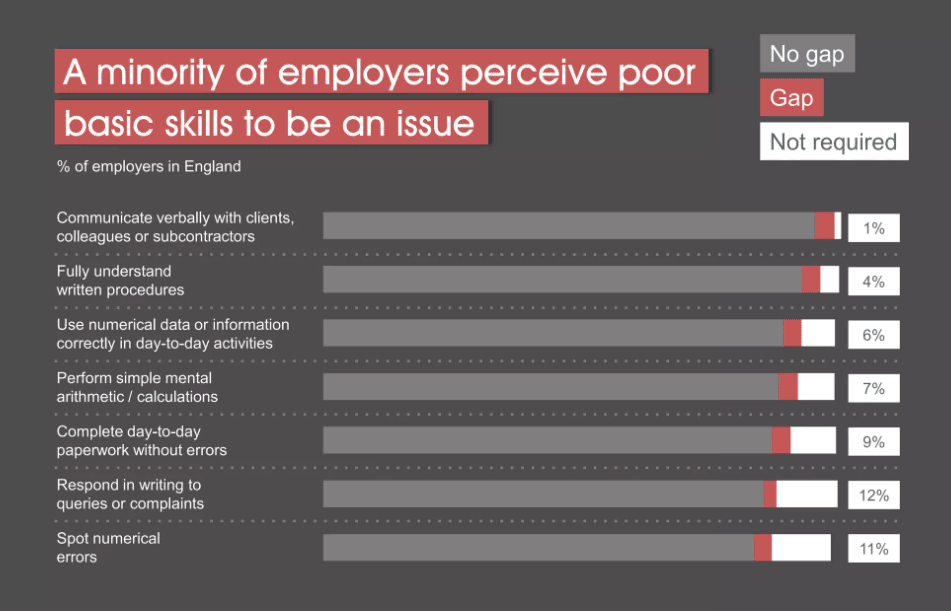
For a presentation to be effective, it is important to visualize key data and takeaways from the presentation. Using charts, graphs, images, and other data widgets, you can show the audience what each statistic represents through visualization. Taking this example of the presentation on the Impact of Poor Basic Skills, we see that the presenter has used different pie charts and graphs to represent numerical data. This helps the audience retain the information and enables the presenter to discuss statistics profoundly.
2. Example 2: Using a Monochromatic Color Scheme
Monochromatic color schemes are very effective and appealing when designing presentations. When using a monochromatic color scheme, it is important to use a variety of shades, tints, and tones of the same color. This will create visual interest and depth in your presentation. Additionally, using a limited color palette will help to keep your presentation looking neat, clean, and polished.
3. Example 3: Visual Hierarchy Design
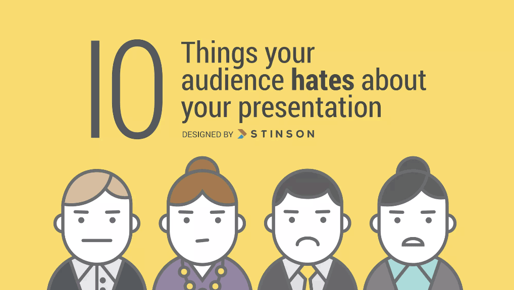
The information must be carefully arranged to increase its appeal and delivery, which is the subject of visual hierarchy. By giving some design elements more prominence than others, visual hierarchy can aid in highlighting what the audience should pay attention to initially during presentations. Presentations can easily become cluttered or chaotic without taking visual hierarchy into account during the design process, making it challenging for the audience to decide what to look at first or how to digest the information offered to them effectively.
Conclusion
Creating a PowerPoint presentation and delivering an effective presentation might seem like a daunting task, but with the proper tips and an easy-to-follow structure, giving an effective presentation can be a piece of cake. It requires careful planning and practice to ensure effective delivery. The key is to know your audience well and deliver your message with supporting visuals, facts, statistics, and other data to reflect your authority on the matter.
We will send you our curated collections to your email weekly. No spam, promise!
