How to Present a Net Promoter Score (NPS) Analysis

Net Promoter Score (NPS) is a widely used metric for measuring customer loyalty and satisfaction. It provides valuable insights into customer sentiment and can help businesses make strategic decisions to improve their products or services. Effectively presenting an NPS analysis is essential for conveying these insights to stakeholders, teams, and decision-makers.
In this article, we will explore the what, why, and how of presenting NPS analysis and provide actionable tips for creating effective presentations. We’ll also showcase some NPS templates available and slides specifically designed for NPS analysis to help you deliver your message effectively.
Understanding Net Promoter Score (What is NPS?)
Net Promoter Score (NPS) is a customer loyalty metric developed by Fred Reichheld, Bain & Company, and Satmetrix. It is based on a simple question: “How likely are you to recommend our company/product/service to a friend or colleague?” Respondents rate their likelihood on a scale from 0 to 10, and are categorized as Promoters, Passives, or Detractors.
NPS is calculated by subtracting the percentage of Detractors from the percentage of Promoters. The resulting score can range from -100 to 100, indicating overall customer satisfaction and loyalty.
Why is Presenting NPS Analysis Important?
Presenting an NPS analysis effectively is crucial for several reasons:
- Informed Decision Making: An NPS presentation can highlight key areas of improvement, helping management make data-driven decisions.
- Understanding Customer Sentiment: Analyzing NPS data can provide insights into customer satisfaction levels and identify potential issues.
- Alignment Across Teams: A clear presentation of NPS results can align all departments on common goals and focus areas.
- Showcasing Business Impact: Effectively presented NPS data can demonstrate how customer feedback translates into business growth and customer retention.
Preparing for an NPS Presentation
To present an NPS analysis effectively, it’s essential to prepare thoroughly. Here are some key steps to consider:
- Know Your Audience: Understand your audience and who you are presenting to—whether it’s senior executives, marketing teams, customer support teams, or product managers. There are different types of audiences. Tailor your presentation to address their specific concerns and interests.
- Collect and Clean Data: Ensure your NPS data is accurate, up-to-date, and segmented appropriately (e.g., by customer type, region, product, etc.).
- Identify Key Insights: Analyze your NPS data to uncover trends, patterns, and key insights. Focus on the most impactful findings that will resonate with your audience.
Crafting a Winning NPS Presentation
Follow these guidelines to create a compelling and effective NPS presentation:
- Set Clear Objectives: Start with a clear statement of the presentation’s objectives. Are you looking to identify areas for improvement, celebrate successes, or outline a strategic plan? Use the SMART goals to define your objectives.
- Structure Your Presentation: A well-structured presentation enhances clarity and engagement. Use the following steps:
- Introduction to NPS: Briefly explain what NPS is and why it matters.
- Overview of Data Collection: Describe how the NPS data was collected, including the number of respondents, methods, and time period.
- Highlight Key Findings: Present the NPS score, along with a breakdown of Promoters, Passives, and Detractors. Use graphs or charts to illustrate these insights.
- Analyze the Results: Dive deeper into the analysis by segmenting the data (e.g., by customer segment, geography, or product line). Discuss trends, patterns, and significant insights.
- Present Actionable Insights: Outline the key takeaways from the NPS analysis and propose actionable recommendations for improvement.
- Future Goals and Monitoring: Share the next steps, such as how the feedback will be used to enhance customer experience and the plan for monitoring future NPS trends.
- Use Visuals Effectively: Use visual slides, charts, graphs, heatmaps, and infographics to visually represent data. This will help convey complex information in an easy-to-understand format.
- Incorporate Real-Life Customer Feedback: Use verbatim quotes from customers to add authenticity and context to your findings. Incorporate them in a Quote PPT slide. This helps humanize the data and makes it more relatable.
Handling Questions and Feedback During Your NPS Presentation
Be prepared for questions and feedback from your audience. Anticipate potential concerns or challenges and be ready to provide evidence-backed responses. Consider including a Q&A slide toward the end of your presentation to facilitate this discussion.
Post-Presentation Strategies for NPS Analysis
The value of an NPS presentation doesn’t end when the presentation does. Consider these post-presentation strategies:
- Engage in Follow-Up Discussions: Encourage stakeholders to provide feedback on the findings and engage in discussions on how to implement the suggested recommendations.
- Leverage Feedback for Continuous Improvement: Use feedback from the presentation to refine your NPS strategies and focus areas. Continuous improvement is key to maintaining and improving customer loyalty.
- Share Presentation Materials: Distribute the presentation slides or a summary slide to all relevant teams to ensure alignment and action on the insights shared. For this purpose, you can use an executive summary slide to summarize your important points.
A Presentation Template Tailored for NPS Analysis
Using a professionally designed template for your NPS presentation can enhance clarity and impact. Here, we introduce an NPS Presentation Template by SlideModel, specifically designed to showcase NPS data effectively.
As an example, a NPS presentation can includes the following usefu slides:
- Introduction Slide: Introduces the NPS concept and its significance.
- Data Overview Slide: Provides a detailed breakdown of the NPS data, including segments.
- Key Findings Slide: Highlights the primary insights derived from the analysis.
- Customer Feedback Slide: Features verbatim customer feedback to add context.
- Recommendations Slide: Outlines actionable recommendations based on the NPS data.
- Next Steps Slide: Presents the future goals and plans for monitoring NPS trends.
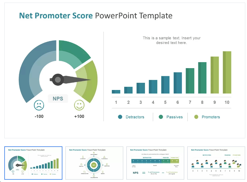
Net Promoter Score PowerPoint Template by SlideModel
Here is an NPS PPT template provided by SlideModel that you can use to prepare a presentation on Net Promoter Score. It contains several infographics and data charts that are useful for an NPS analysis presentation.
An effective NPS template must include various slides specifically designed to present NPS data clearly and effectively. Here are a few examples:
- Introduction to NPS: This slide provides an overview of the NPS concept, its calculation method, and its significance in measuring customer loyalty.
- NPS Score Breakdown: Visualize the distribution of Promoters, Passives, and Detractors with graphical elements like gauges and bar charts. This helps to quickly communicate the overall NPS score and its components.
- Survey Question Slide: Displays the key survey question, “How likely are you to recommend our product/service?” with a visual scale from 0 to 10, illustrating the customer response range.
- Customer Feedback Overview: Showcases key customer comments or qualitative feedback to add context to the NPS score, highlighting both positive and negative responses.
- Supporter Satisfaction: Presents detailed metrics of supporter satisfaction levels, using graphs to illustrate data such as customer satisfaction scores and percentages.
- Satisfaction Dashboard: Provides a comprehensive dashboard of satisfaction metrics, including customer satisfaction rate, NPS score over time, and comparison with benchmarks or industry standards.
- Actionable Insights Slide: Lists the key areas for improvement based on the NPS feedback, with visual icons and text to make recommendations clear and actionable.
- NPS Improvement Tips: Offers practical suggestions on how to enhance the NPS score, using bullet points and visual cues to engage the audience.
- Customer Loyalty Chart: Illustrates customer loyalty metrics, such as retention rates or repeat purchase rates, using charts and diagrams to highlight the impact of the NPS on business outcomes.
- Performance Summary Slide: Summarizes the overall performance, highlighting key metrics and insights derived from the NPS analysis.
- Strategic Dashboard: Features a visual representation of various metrics such as customer feedback trends, NPS progress over time, and other relevant KPIs to provide a holistic view of customer sentiment.
- Conclusion and Next Steps: Recaps the key points discussed throughout the presentation and outlines the next steps for leveraging the NPS data to drive improvements.
By using this NPS PowerPoint template, you can present your analysis in a structured and visually appealing way, ensuring clarity and engagement for your audience. The slides are designed to be 100% editable, allowing you to customize them with your specific data, colors, and branding.
To present an NPS analysis effectively, it’s essential to use the right types of diagrams and visual elements. The NPS PowerPoint template includes a variety of diagrams specifically designed to make data more understandable and engaging. Here are some of the key diagram types included in the template:
- Gauge Chart: This circular gauge or dial chart visually represents the NPS score, with a needle indicating the score within a range that includes Detractors, Passives, and Promoters. It’s a quick and impactful way to convey the overall NPS score at a glance.
- Bar Charts: Several bar charts are included to display comparative data, such as the percentages of Promoters, Passives, and Detractors, or different customer satisfaction scores. These charts provide a clear and straightforward comparison between various segments.
- Line Graph: A line graph or trend line illustrates changes in NPS scores or customer satisfaction levels over time. This type of diagram is ideal for showcasing trends, growth, or declines in customer sentiment, allowing viewers to quickly identify patterns.
- Balance Scale Diagram: A balance scale visual is used to compare two opposing elements, such as positive versus negative feedback or Promoters versus Detractors. This diagram helps convey a balanced view of customer sentiment.
- Customer Satisfaction Dashboard: This comprehensive slide combines multiple visual elements, including pie charts, bar charts, and percentage indicators, to provide a holistic overview of various customer satisfaction metrics. It is designed to display a summary of key data points on a single slide.
- Pie Charts: Pie charts depict the proportions of different categories, such as the distribution of responses (Promoters, Passives, Detractors) or overall satisfaction levels. They offer a simple and effective way to represent parts of a whole.
- Infographic Elements: The template includes visual icons, such as thumbs up/down, stars, and checkmarks/crosses, to represent qualitative feedback, satisfaction ratings, or key takeaways. These infographic elements add visual appeal and help convey messages quickly.
- Heat Map: A heat map uses color coding to display the intensity or frequency of customer feedback, allowing viewers to easily identify areas that have the most significant impact on the NPS score.
- Bullet Point List with Icons: Slides that feature icons alongside bullet points are used to present actionable insights, recommendations, or key findings. These visuals help draw attention to important points and make the content more engaging.
- Progress Circle or Donut Chart: Circular progress indicators or donut charts display completion rates or percentages related to satisfaction, loyalty, or other key performance indicators. These charts are useful for illustrating progress or achievements visually.
Real-Life NPS Presentations & Case Studies
Before concluding, let’s explore some real-life examples of successful NPS presentations from various industries. These examples highlight how different companies have leveraged NPS analysis to improve their customer experiences and drive business growth.
Real-Life NPS Presentations & Case Studies
To understand the impact of effectively presenting NPS data, let’s explore some real-life examples and case studies where businesses have successfully leveraged NPS presentations to drive positive outcomes.
- Apple’s Use of NPS to Enhance Customer Experience:
Apple has been a pioneer in using NPS to understand customer satisfaction and loyalty. By regularly collecting NPS feedback from customers after product purchases and support interactions, Apple identified key areas for improvement, such as in-store experience and customer support efficiency. Their presentations to internal teams highlighted these insights, enabling Apple to implement targeted initiatives like improving Genius Bar wait times and enhancing online support tools. As a result, Apple increased its NPS score and saw improved customer satisfaction and loyalty, ultimately contributing to its brand’s strong reputation. - Amazon’s Focus on Customer Feedback to Drive Growth:
Amazon uses NPS extensively to monitor customer satisfaction across its vast range of services, from e-commerce to AWS. Regular NPS presentations to executive leadership highlight trends in customer sentiment and identify specific pain points, such as delivery delays or issues with the user interface. By prioritizing these areas for improvement and setting clear objectives, Amazon was able to make data-driven decisions that improved its overall NPS score, resulting in higher customer retention rates and growth in prime membership. - Slack’s Strategy for Product Development Using NPS Data:
Slack, the popular communication platform, uses NPS feedback to guide its product development roadmap. After gathering NPS data, the team presents findings to stakeholders, highlighting features or functionalities that customers find most valuable, as well as those they see as lacking. These insights help Slack prioritize development efforts and introduce new features that align with customer needs, leading to increased satisfaction and adoption rates. Slack’s NPS-focused presentations ensure all teams are aligned on customer-centric strategies. - Airbnb’s Use of NPS to Improve Host and Guest Experiences:
Airbnb leverages NPS data to evaluate both host and guest experiences. NPS presentations showcase detailed insights about pain points like booking challenges or property expectations mismatches. By sharing these findings with both operational teams and property owners, Airbnb implemented changes to improve the listing accuracy, streamline the booking process, and enhance communication tools between hosts and guests. These efforts were reflected in their improved NPS scores and contributed to stronger customer loyalty and repeat usage. - HubSpot’s Customer Success Focus with NPS Analysis:
HubSpot, a leader in marketing and sales software, uses NPS as a key metric for its customer success team. By regularly presenting NPS data in internal meetings, HubSpot identifies opportunities to enhance their onboarding process and support resources. The presentation slides often highlight customer feedback verbatim, along with segmented NPS scores by customer size and region. This approach enables the team to tailor strategies for different customer segments, resulting in increased satisfaction and a boost in renewals and upsell opportunities. - Zappos’ Continuous Improvement Culture Fueled by NPS:
Zappos, known for its exceptional customer service, incorporates NPS into its daily operations. The company uses NPS presentations to track customer sentiment across different touchpoints, from order placement to post-purchase support. By presenting these findings to all levels of the organization, Zappos ensures a continuous feedback loop, where all employees are aware of customer expectations and motivated to improve service quality. This focus on NPS has helped Zappos maintain high customer satisfaction and loyalty, even in highly competitive markets.
Books to Learn More About Presenting NPS Analysis
To gain a deeper understanding of how to effectively use and present Net Promoter Score (NPS) data, consider exploring these three insightful books:
- “The Ultimate Question 2.0: How Net Promoter Companies Thrive in a Customer-Driven World” by Fred Reichheld and Rob Markey
Written by Fred Reichheld, the creator of the Net Promoter Score (NPS), and Rob Markey, this book provides a comprehensive overview of the NPS methodology and its impact on customer loyalty and business growth. It offers practical advice, real-world case studies from leading companies, and strategies for creating a customer-centric culture through NPS. This book is an excellent starting point for understanding the fundamentals of NPS and how it can be leveraged to improve customer experience and drive growth. - “Measuring Customer Satisfaction and Loyalty: Survey Design, Use, and Statistical Analysis Methods” by Bob E. Hayes
Bob E. Hayes’ book offers a detailed guide to designing customer satisfaction and loyalty surveys, including how to effectively use NPS. It provides valuable insights into various methodologies for collecting and analyzing customer feedback data and includes practical guidance on statistical methods to interpret customer sentiment. This book is ideal for those interested in survey design, data analysis, and presenting findings to stakeholders in a way that drives meaningful action. - “Winning on Purpose: The Unbeatable Strategy of Loving Customers” by Fred Reichheld
In this follow-up to “The Ultimate Question,” Fred Reichheld explores the deeper philosophy behind NPS and its importance as a tool for customer-centric business strategies. The book shares new insights, real-life stories, and practical examples of how companies can achieve success by prioritizing customer loyalty. It also provides actionable advice on how to communicate NPS findings effectively within an organization to foster a culture centered around customer value.
These books provide a solid foundation for understanding how to use NPS data strategically and present it in a way that maximizes its impact on your business. Whether you are new to NPS or looking to enhance your current practices, these resources will help you leverage NPS to drive customer satisfaction, loyalty, and growth.
Conclusion
An effective NPS presentation can drive informed decision-making, align teams, and demonstrate the impact of customer feedback on business growth. By understanding how to present NPS data and following the steps outlined in this article, you can create a compelling and insightful presentation that resonates with your audience.