How to Make a Development Diamond Diagram in PowerPoint
In PowerPoint you can make a development diamond PowerPoint template by using the PowerPoint radar chart. This kind of diagrams is used for example to compare countries GNP or GDP per capita. You can use this approach to assess the level of development in a given country. But higher per capita income in a country does not always mean that its people are better off than those in a country with lower income, because there are many aspects of human well-being that these indicators do not capture.
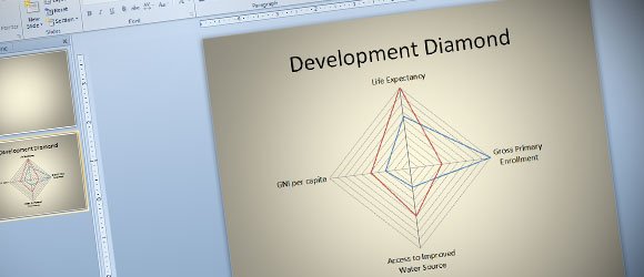
Some experts World Bank use the development diamonds to portray relationships among four socioeconomic indicators for a given country relative to the averages for that country’s income group (low-income, lower-middle-income, upper-middle-income, or high-income).
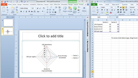
You can use different series in the same chart. In PowerPoint for example you can insert a radar chart to make this kind of diamond and then add four different values. Life expectancy at birth, gross primary enrollment, access to safe water, and GNP per capita are presented. In PowerPoint for example you can put one on each axis as we show in the following screenshot.
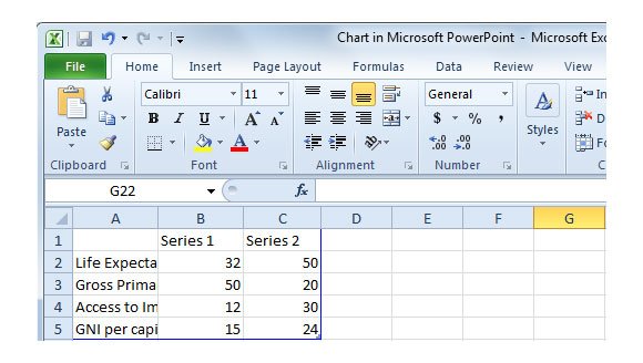
Each value will be connected with bold lines to form a polygon. The shape of this development diamond.
If you want to compare GDP for different countries, then you can insert another diamond in the slide design.
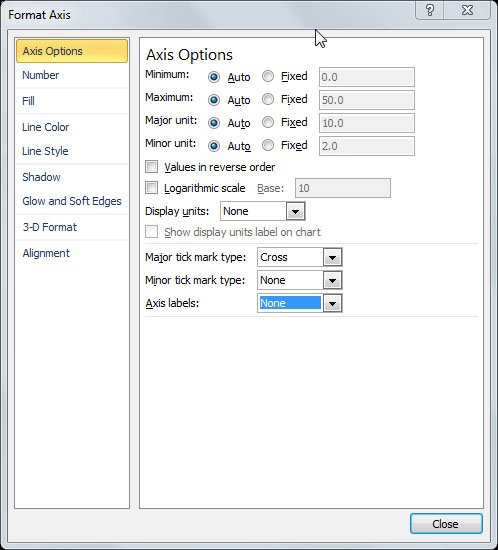
In PowerPoint you can remove the axis labels by right clicking on the axis labels and then click on Format Axis.
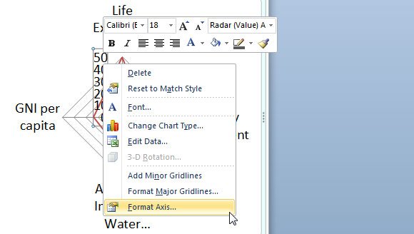
As you can see in the following options, here you can control the axis options for example reverse the order of values or use a logarithmic scale which may be useful for some charts and data visualization, but you can also remove the axis labels by changing the combo to None.
Botswana’s development diamond has a triangular shape because data on the percentage of its population with access to safe water were unavailable in the World Bank.
