How to Create a Winning Mission Statement Slide for your Presentation

The mission statement slide isn’t just another slide in your deck; it is integral to many presentations especially in the corporate, non-profit, and startup sectors. An effective mission statement slide can help to communicate the core values and objectives of an organization, acting as the nucleus of your organization’s ethos. A well-crafted mission statement slide is essential in a business presentation, company profile or pitch deck.
In presentations, as in life, first impressions matter. The mission slide provides a snapshot of your organization’s core values and purpose. A captivating design and clear message can leave an indelible mark. It also helps to build trust, as authenticity and transparency are more crucial than ever. A clear mission builds trust, conveying to stakeholders that your organization has a distinct and sincere purpose.
Designing a Winning Mission Statement Slide
Design is the language of visuals and it also applies when designing an effective mission statement slide. Each element, from font choice to colors, tells a part of your story. The typography, for instance, should be easily readable across various devices. A font that reflects the modernity of today, but holds the promise of timelessness, can be a perfect bridge between the present and future of your brand.
Colors don’t just fill space; they evoke emotions. While red can channel passion, blue can infuse a sense of trust. The chosen palette should resonate with your mission’s spirit. Lastly, the layout plays a pivotal role. Embracing balance and whitespace ensures that your mission statement is the undeniable centerpiece of the slide, unhindered and bold.
You can use metaphors to convey the mission statement. Here are some possible ideas of metaphors that you can use to illustrate your mission statement slides.
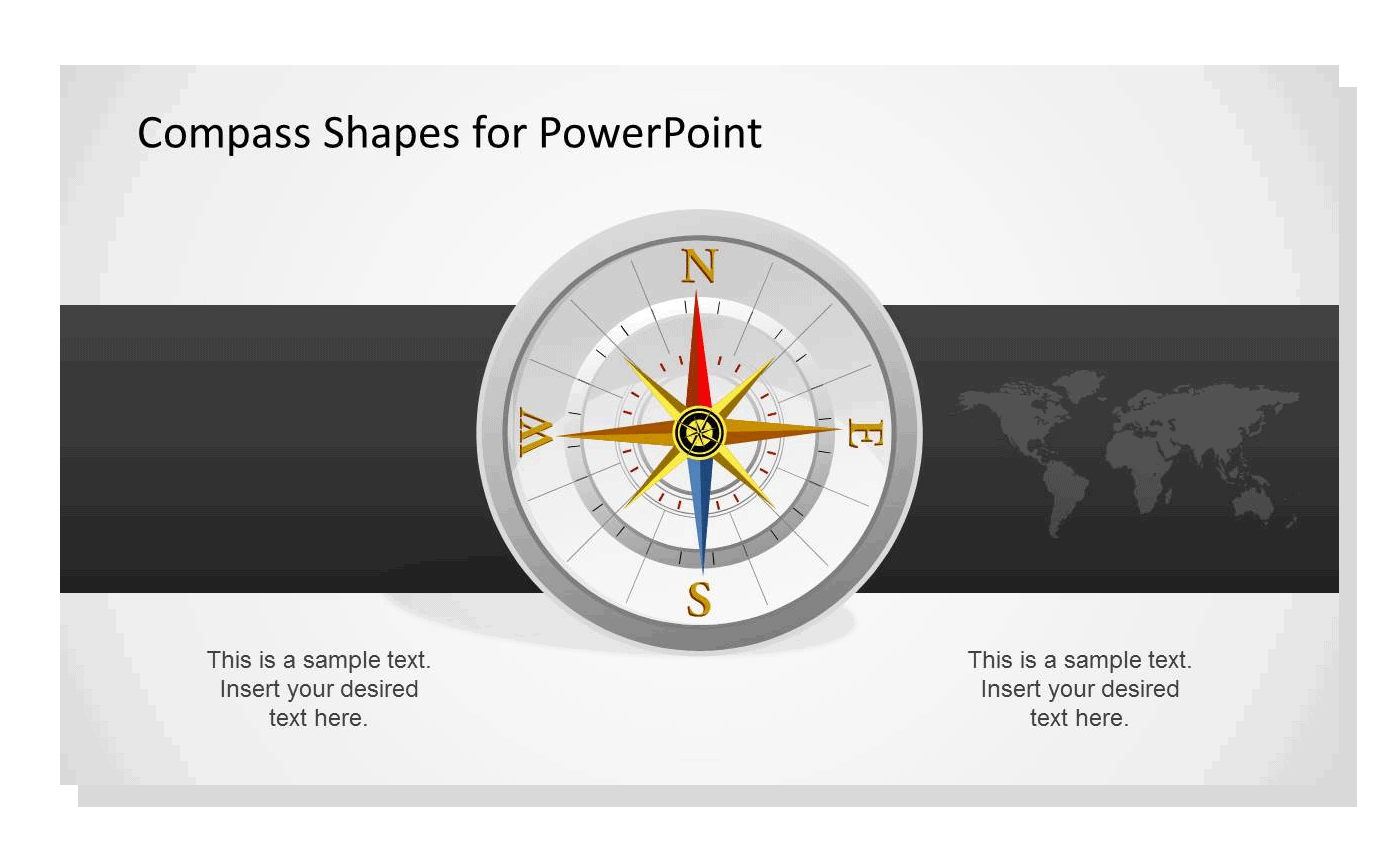
Compass Illustration: An age-old instrument for navigation, a compass metaphorically captures the essence of direction and purpose. Just as a compass points towards the North, guiding travelers on their journey, your mission statement acts as a directional tool, steering your organization towards its goals. A beautifully rendered compass, perhaps even animated to settle on a specific direction, can serve as a backdrop or central image for your slide, underscoring your commitment to a defined path.

Lighthouse Illustration: A beacon of light in the darkest of nights, a lighthouse stands tall, guiding ships safely to shore. It represents illumination, guidance, and unwavering strength. By incorporating a lighthouse into your mission statement slide, you metaphorically communicate that your organization acts as a guiding light, ensuring safe and successful navigation through industry challenges.
Bridge Illustration: A bridge serves as a connector, allowing one to move from one point to another, overcoming obstacles like rivers or valleys. When utilized as a metaphor in your slide, a bridge can signify the idea of connection, transition, and overcoming challenges. It can suggest that your organization’s mission is to bridge gaps, whether they’re in the market, among communities, or in knowledge.
Tree Illustration: Symbolizing growth, strength, and connection, a tree can be a powerful metaphor for an organization’s mission. Its roots represent the firm foundation of values and principles, the trunk stands for stable growth and strength, and the branches with leaves or fruits showcase the outcomes and reach. Incorporating a tree can convey that your mission is grounded, yet always growing and branching out to achieve more.

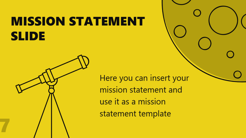
Telescope Illustration: As you’ve mentioned, a telescope is an instrument that allows us to see distant objects, bringing the faraway close. In the context of a mission statement slide, it symbolizes vision, foresight, and aspiration. By using a telescope infographic as a metaphor, you’re emphasizing that your organization is not only focused on the present but is also looking ahead, gearing up for future challenges and opportunities.

Crafting the Content of your Mission Statement Slide
A meticulously crafted mission statement encapsulates an organization’s essence. Achieving conciseness without compromising depth is crucial. A precise statement should provide clear insight into your organization’s core, with language and tone consistent with your brand identity. Incorporating elements of storytelling can elevate your mission from simple text to a compelling narrative.
Incorporating Visuals to your Mission Statement Slide
A picture is worth a thousand words, but the right visual is priceless. Integrating relevant icons and symbols to your mission statemnet slide offers a visual shorthand, making your message instantly recognizable.
Imagine the universality of a tree symbol; it might speak of growth, sustainability, or interconnectedness, all with elegant simplicity. Complementing your text with a background image amplifies its gravitas. However, this image should be a silent partner to your words, reinforcing, not overshadowing the mission. To enhance the immersive experience, consider integrating subtle animations. The gentle fade of text or a soft zoom on an image can engage without distracting. You can use an editable mission statement template to ease this job.
Real-world Examples
Consider Envicorp, an fictitional environmental startup. Their mission slide, with its minimalist design set against a backdrop of a thriving forest, perfectly embodies their motto:
“Empowering a greener tomorrow.”
Or consider Children Saver, another finctional non-profit dedicated to children in conflict zones. Their slide, adorned with a child’s animated drawing, becomes a symbol of hope amidst despair, echoing their mission.
Evolution of the Mission Statement Slide
Mission slides have journeyed from static, text-heavy templates to vibrant, dynamic canvases. Being attuned to contemporary design movements ensures your mission slide remains both relevant and riveting.
Your mission doesn’t exist in a presentation vacuum. Extend its essence to every facet of your branding. The same hues that color your slide can breathe life into your website, the typography can echo in your emails, and the imagery can adorn your social media. Even in print, from brochures to business cards, the heartbeat of your mission should be palpable.
Conclusions
The mission statement slide is not just a declaration; it’s an embodiment of your organization’s very essence. In our rapidly evolving digital landscape, where attention is fleeting, a well-crafted mission slide is your anchor. Design it with heart, pen it with passion, and let its echo reverberate across the spectrum of your brand.
