How to Analyze Data Quickly in Excel
Over the years, Excel has been widely used for collecting, documenting, and analyzing data. It has undergone many changes and improvements over time, adding different features that are relevant to the demands of today. With Big Data as one of the many important things businesses and organizations rely on to make sound plans and decisions, it’s now more than ever, important to be able to effectively and efficiently analyze even large amounts of data. Here is how to analyze data quickly in Excel.
While before, you can easily do so with the help of Excel’s many visualization, charting, and graphing tools, it has now come up with its Quick Analysis tool to help make things so much easier for all its users.
Excel’s Quick Analysis Tool
Excel’s Quick Analysis Tool has been around for a while. This nifty feature allows you to analyze your data much more quickly and maximize the software’s different tools.
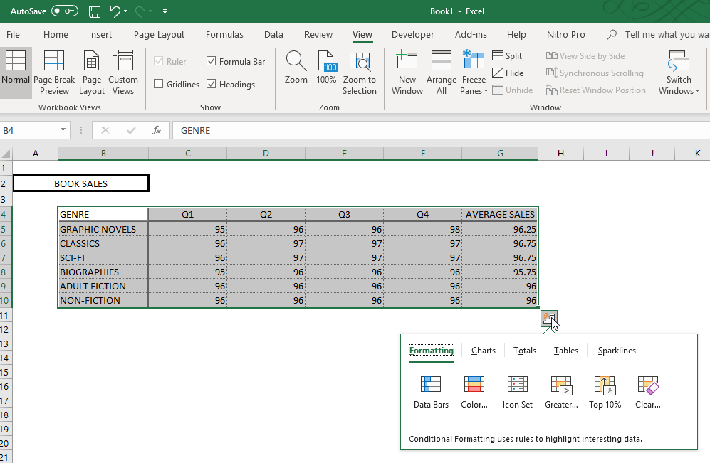
You can use Quick Analysis with a range of cells or a given table of data. Once you have selected the data you want to analyze, you then have the option on how you want to analyze it, using charts, tables, sparklines, totals, and other options.
What’s great about the Quick Analysis Tool is that you can hover over the options and the choices under these options so you can have a preview of how your data analysis will look like before you finally select the choice that you want.
How to Use the Quick Analysis Tool
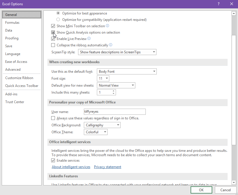
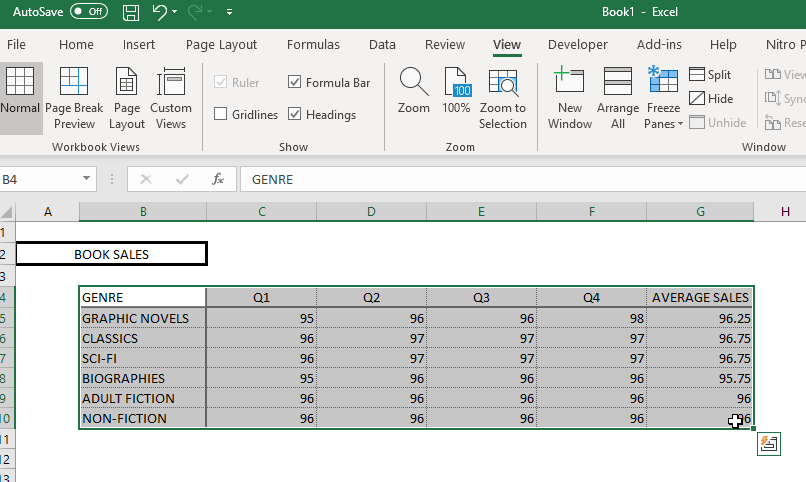
First of all, check first if your Quick Analysis Tool feature is turned on. This is because you have the option to turn this on or off, depending on your specific needs. Usually, when this feature is active, you will see a Quick Analysis button in the lower right-hand corner of the data range you have selected.
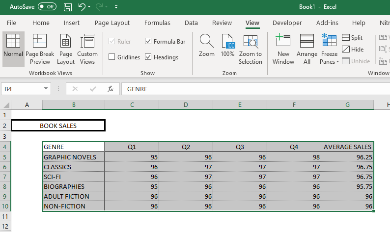
If you have selected a data range in your spreadsheet and the button does not appear, your Quick Analysis button may have been turned off. In order to turn this feature on, go to the File tab. Under this, click on the Options button. The Excel Options dialog box will appear, and under this, go to the General tab, here, you will see the ‘Show Quick Analysis options on selection’. Make sure to check the box next to it. You may also press Ctrl+Q on your keyboard to display the Quick Analysis options.
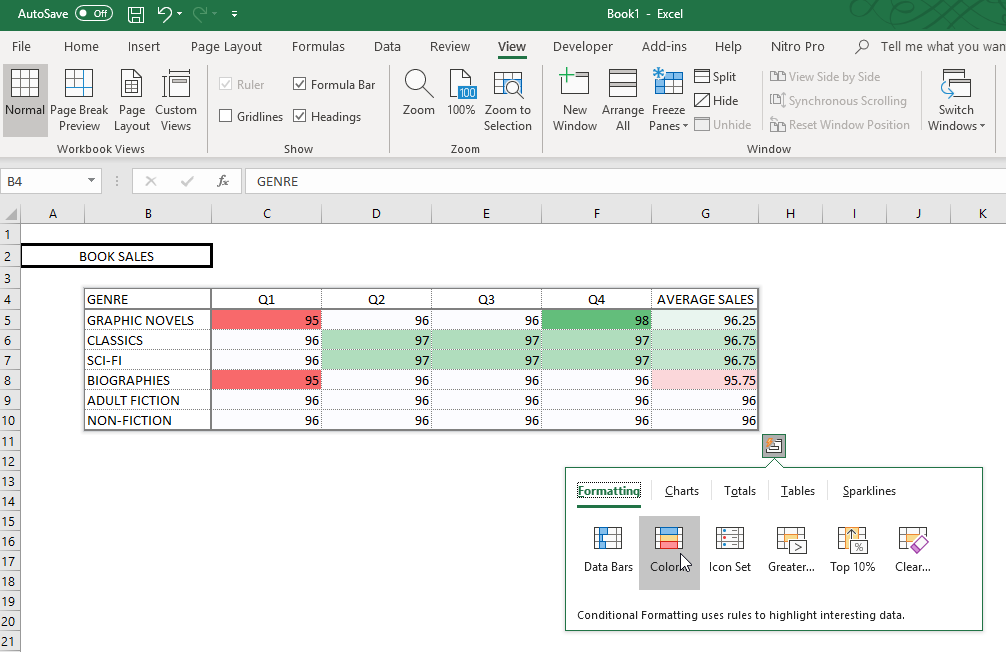
Now, go back to your spreadsheet to select a table or data range. The Quick Analysis button should now be present. Click on this to populate the Quick Analysis options: Formatting, Charts, Totals, Tables, and Sparklines.
How to Use the Different Quick Analysis Options
The different Quick Analysis options allow you to visualize your data in different ways.
First, the Formatting option allows you to highlight parts of your data by changing the colors of the cells, adding data bars, or including sparklines, among many other options.
Second, the Totals will allow you to automatically calculate the numbers in the columns and rows of your selected data. You can also use other functions such as Sum, Average, Count, and many others. This is very useful because you skip the process of manually inputting the formula at the end of each column or row.
Third, the Tables option allows you to filter, sort, and summarize your data in the format of the table, with the PivotTable options as well.
Fourth, the Chart option allows you to present your data through various charts. Excel has many chart options to choose from, so you can best visualize your data.
Lastly, the Sparklines option allows you to add tiny charts that you can show alongside your data as a single cell for each row or column. This allows you to see small trends in one category of your choosing.
