Google’s New Material Design: What It Means For Users
With Google launching their latest version of Android OS, there is a lot of talk about ‘Material Design’. Google has laid a lot of emphasis on the concept of material and also asked developers to migrate over to this new design concept at the earliest and reap the benefits.
What it means for users?
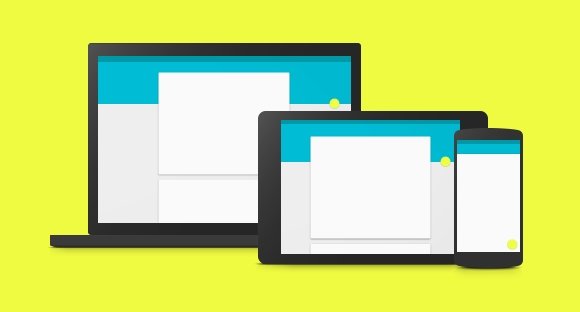
The concept of material is all about designing in layers, providing the power to the users and improve the way they interact with a particular application. Google aims at creating a unified design language with this new and revolutionary concept of material design.

Better designs
Google’s Material Design offers a whole new world of amazing transitions and animations and evolves the entire design process while unifying it by providing guidelines that developers need to follow to come at par with the rest of the Android Universe. For users it means that they are going to get better interfaces, bold colors, and superb designs.
Amazing apps
Applications would evolve with time to adapt to the concept of Material. The users are in for a treat with the advent of amazing apps designed using the material concept. This would be the next iteration in the lifecycle of the apps that already exist and the building standard for the apps that are to be released in the coming future.
Easier interactions with your device
Material Design promotes working in layers, with the concept catching up in Android L, users would be more than happy to interact with the new things that material offers to them. It becomes easier to interact and respond to notifications and work in layers and stack them up for easier transition between two or more apps. Users are going to love this newfound power.
More than easy to multitask
Since you are going to work in layers it becomes easier for you to switch from one layer to the other without having to close either of them. This makes it easier for you to multitask and thus make the most of your Smartphone experience.
