How to Use Excel Pivot Tables
Last updated on October 4th, 2024
Excel Pivot tables is a great feature available in Excel that lets us summarize data in the spreadsheet. Using Pivot Tables we can reorganize, sort, count, total or give the average of the data stored in one table or spreadsheet, displaying the results in a second table what is the called “pivot table” and showing the summarized data. This is an essential part of a business intelligence suite or OLAP tool.

Excel Pivot Tables are very useful for quickly creating unweighted cross tabulations. Excel user can create a Pivot Table by dragging and dropping fields graphically. You can use some operations like rotation or pivoting of the summary table. Pivot tables were originated Lotus’ spreadsheet program, Lotus Improv. The program included a feature that grouped and aggregated data to make analysis simpler.
Pivot term is also used in Basketball and means the action a player will use while in possession of the ball to move in any direction while still keeping one foot in contact with the floor.
You can create pivot tables in Excel and then turn the data (by using the concepts of slice and dice) to view it from different perspectives.
Example – How to Create a Pivot Table
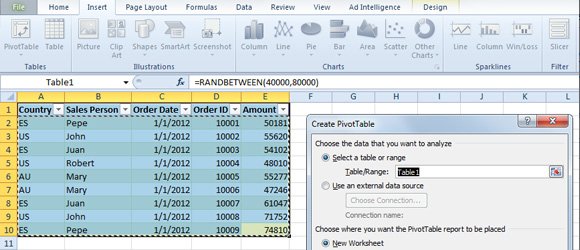
Here we will see how to create a simple pivot table to see how it works, based on the following table with sales amounts per sales person, country, order date and order ID.

Go to Insert -> Pivot Table and then choose Pivot Table option to create a summarized report from complicated data and adding the ability to drill down on details.

So having selected the data table used as source data for the pivot table, click Pivot and a dialog will appear. Or you can select the Pivot Table data range in the dialog.

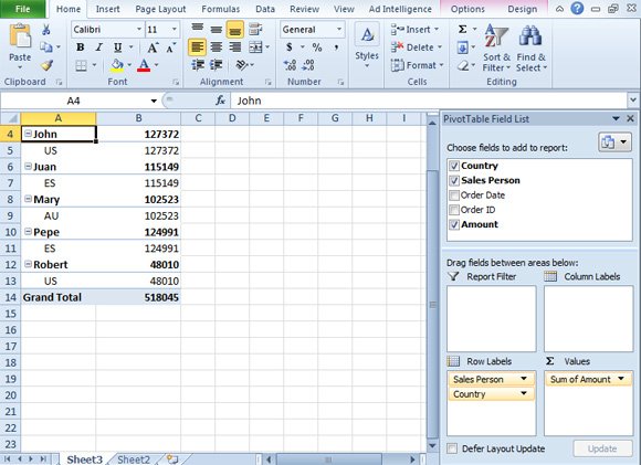
Now you need to start choosing what fields to add to the report. You can select the fields and Excel will try to identify the right area to place it (row labels, column labels or values), however now it is your job to move the fields among the different areas to build your report. For example, numeric values can be treated as values when you check it in the Pivot Table Field List and text values or labels will be added to Row Labels.

If you want to use drill down and drill up, you can add more than 1 label to the row labels section. For example in this case we have added Sales Person in the first place (so it will be displayed in the top of the hierarchy) but then you can see we can drill down to see the sum of amount per Country.
This enables us to build rich reports using the table that was in the other spreadsheet and used as source of the pivot table. There may exist many other useful examples for pivot tables, for example you may be interested to list monthly sales totals for large number of product items.
Configure Pivot Table Options
You have plenty of options to configure your pivot tables. Right click on the pivot table and then PivotTable Options to access the dialog with the options. Here you can configure for example if you want to display grand total for rows and columns, or display options for example to merge and center cells with labels. You can configure to use an empty text for zero values or how to display the filter area (Down, Then Over or viceversa).

Now you can explore how to create your own reports using Pivot Tables and explore the usage of Pivot Charts, which, in fact, let you add nice charts from summarized data in the same way we did for pivot tables in Excel. Different vendors have different names for pivot tables, for example Monarch from Datawatch may call it differently as well as other OLAP products, but Pivot Table was a trademark of Microsoft. We hope this Excel pivot table tutorial was helpful for your report needs. If you have any questions, feel free to ask in the comment, and we will try to answer.
