Comparison Table Layouts in PowerPoint
Last updated on November 13th, 2024
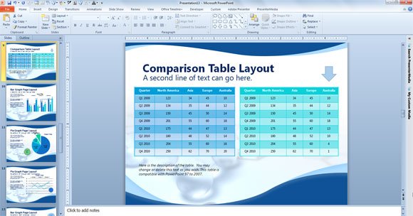
Sometimes you need to compare data and show this comparison easily to the audience. The final goal will be to have a visualization tool that help the audience to compare and explain what are the difference between two sets of data. PowerPoint comes with a comparison layout that helps you to show a comparison between two different textboxes. However, if you need to compare tables then you can insert two tables side by side. Here we will show you a design that is prepared for comparison of tables instead of text data.

The comparison slide template design used for this comparison table layout is very basic, but useful and effective. To compare tables in PowerPoint you can use the default comparison layout that will add two textboxes in the slide.
However, if you need to compare tables, then you can replace the default text boxes by tables. Learn how to insert tables in PowerPoint if you need more information. Using this design and layout you can easily compare tables and data sets row by row. If you need to highlight a particular row, then you can change the format and color of the row.
We got these ideas inspired in the free scientific template for PowerPoint, that includes a summary or agenda layout where you can put the schedule for your presentation or event.
