Chart Analysis Tools in PowerPoint
Last updated on September 4th, 2024
Chart analysis is good to use in mainly showing the distance between high and low points as well as making predictions on increasing and decreasing values over a period. In this tutorial we’ll explore what the Analysis Tools in PowerPoint’s Chart Tools section does.
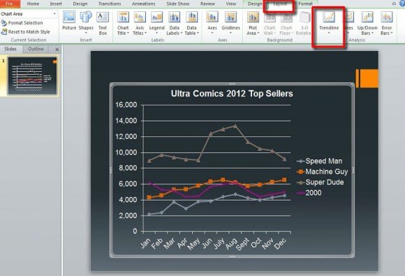
To start you will need a 2D bar or line chart. Select your finished chart in the slide to activate it. If done correctly Chart Tools will appear. Click on Layout and you’ll notice Analysis to the far right.
In the Analysis section you’ll see Trendlines, Lines, Up-down Bars, and Error Bars. Three of these were touched on briefly in our Chart Layout tutorial. First, let’s start with Trendlines.
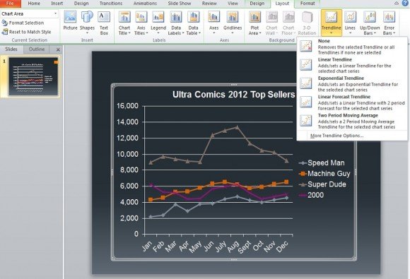
The function of trendlines is right there in the name. It’s a line that shows the trend of a series over a period. Linear Trendline, Exponential Trendline, and Linear Forecast Trendline might seem the same and largely they are, but the trendline added to a series tend to show the natural progression from a certain point.
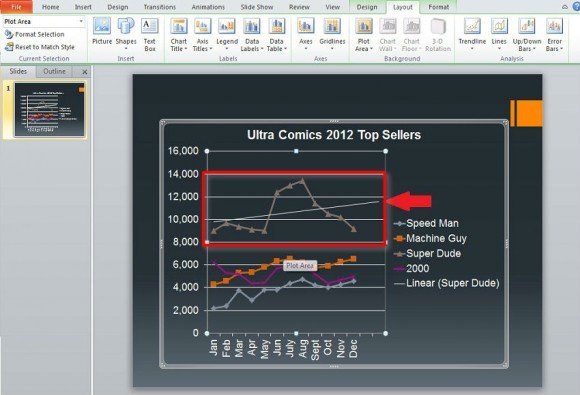
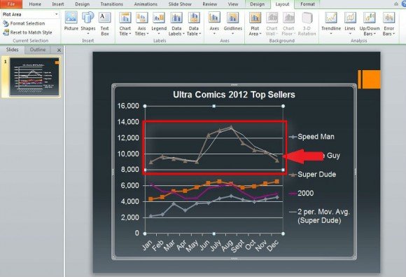
The above image shows the Exponential Trendline which is great for when values rise and fall at significant amounts. Below we have the Two Period Moving Average which is very different from the other three in that it more closely follows the highs and lows indicated in the chart for a series.
In the Lines section, you have the easiest to use of the Analysis Tools. They do nothing for the most part. First let’s look at Drop Lines. This type of line goes from the top most points of the chart to the very bottom value. In the example below, it goes from the line containing the Super Dude series’ values and down to 0, the bottom most value.
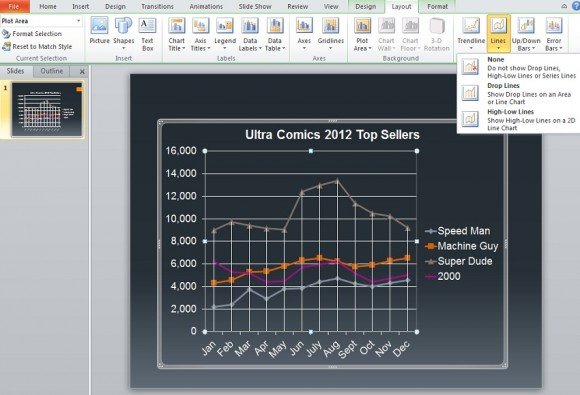
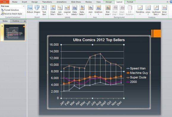
With High-Low Lines once again the lines start at the top most series values and run to the lowest series values. In the example below it concerns the values for the Super Dude sales and the Speed Man sales.
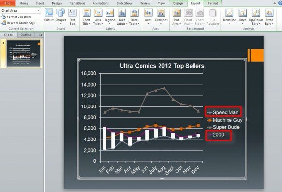
Up-down Bars simply show the different in value’s data points between the first and last series. In the example provided, the first and last series entered in the Microsoft Excel data were Speed Man and 2000. So the bars shown in white indicate the differences at points between these two.
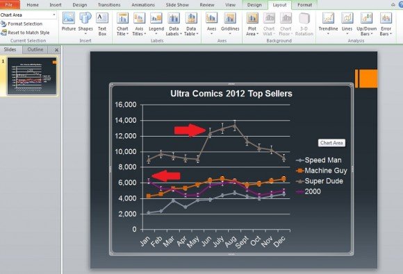
Finally we have Error Bars which show errors for a certain series depending on certain criteria and equations.
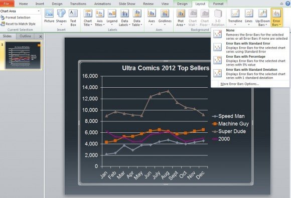
The criteria and equations include 5% positive or negative or using processes known as Standard Deviation and Standard Error. These two require some knowledge of equations to gather how exactly the error values are calculated. The example below uses 5% positive or negative error.
All of these tools have their own options to change their appearance such as color or outline.
Remember, the Analysis Tools are usable for 2D line and bar graphs. They are better used for charts with multiple series and significant growth/decline over different periods. That’s not to say they can’t be used for charts that don’t have significant growth/decline, but the differences shown might be subtle at best. Using analysis tools in PowerPoint you can do different analysis and complement it with other analysis like root cause analysis tools, network analysis tools, handwriting analysis chart, business analysis tools, SWOT analysis and more.
