How to Change Pie Chart Colors in PowerPoint
To make a Pie Chart in PowerPoint you just need to insert a new chart and choose the pie chart type in the dialog box. This will open a new spreadsheet where you can edit the pie chart data. Alternatively you can copy your charts from Excel into PowerPoint slides and the data will be available as well.
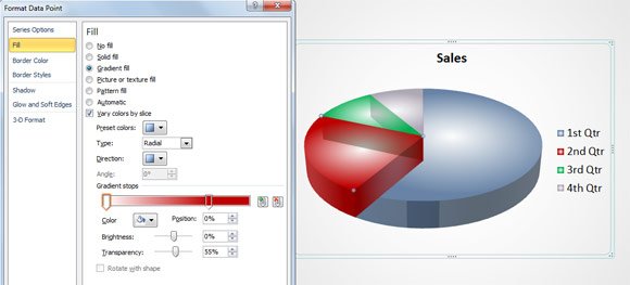
Now, if you want to customize or change the pie chart colors in PowerPoint to choose other different colors than the default palette colors then you can manually do that.
Here we will cover a few ways to change pie chart colors in PowerPoint 2010, but the approach is the same in PowerPoint 2013.
Use the Chart Tools menu to change Pie Chart Colors
The easiest way to change the pie chart colors is by using the Design menu under Chart Tools menu in the PowerPoint ribbon. Once the chart is selected, you can easily pick a color scheme from this menu to be used in the pie chart.
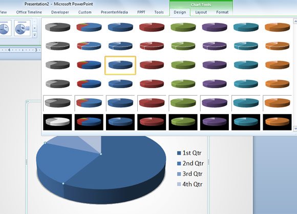
However, sometimes the default color schemes available in PowerPoint are not enough, especially if we need to follow the corporate visual identity.
Manually Change Pie Chart Colors in PowerPoint
Alternatively you can manually edit the color used for series in the Pie Chart. Double click over the chart area and then choose Fill in the Format Data Series dialog box. Now you can choose the gradient fill or solid fill to replace the pie chart color.
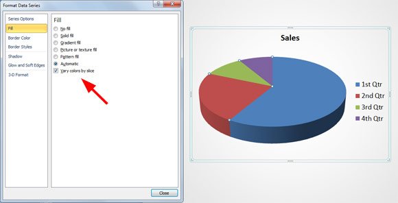
In the following figure you can see how we have changed the pie chart color to use gradient fill with glossy effect.
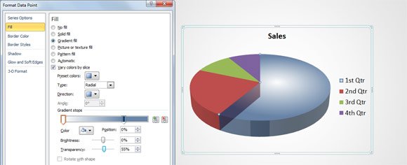
You can repeat the process and replace all the colors by any desired new color.

It is interesting to see that we can choose any desired color from the Themes color palette or the standard color palette. Moreover, you can add a gradient fill and use transparency to achieve great effects.
