
Advertisement
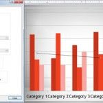
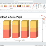
How To Use Chart Templates in PowerPoint to Save Time Designing Data Driven Charts
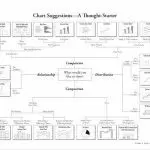
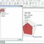
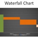
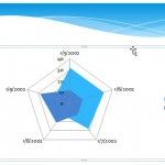
In PowerPoint, you can save your chart design as a chart template for future use. This feature can be really helpful if you want to design custom charts using styles and effects and save it as a template using your corporate visual identity or brand identity. You can also use chart templates to speed up …