The Difference between Calibri vs. Calibri (Body) in PowerPoint
While working with Microsoft Office documents, in PowerPoint or Word for instance, there are different fonts available to use. Calibri is one of the most popular fonts used nowadays. In PowerPoint, there is a subtle difference when you set Calibri vs. Calibri (Body) as the font for any text element.
The reason why there is a distinction between Calibri (Body) is that setting this font to any shape or text element, facilitates later to edit the font globally for the presentation level. Having said this, someone who use Calibri (Body) for text boxes can later go to Design tab in PowerPoint and choose Fonts option to set the fonts used for the presentation and make a global change from there.

To realize this effect, we can test the following procedure:
- Open a new slide and add a new textbox. Then, set the textbox font to Calibri (Body)
- Then, add a new textbox and set the font to regular Calibri.
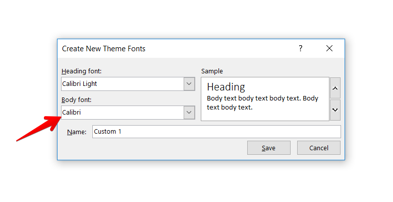
- Now, go to Design -> open small popup under Variants section and click Fonts option, then click Customize Fonts to set a new font family. Change the default font for Body and Save to close the dialog.
- Finally, see the results. The textbox where you set the Calibri (Body) font should now be changed to the new font that you assigned under Customize Fonts dialog, while the third textbox you added should not be updated.
The same happens when Calibri (Heading) is being used instead of just Calibri.
How to take advantage of Theme Fonts?
A presenter can take advantage of this feature and make the presentation easy to edit. A presentation having a lot of slides can easily be updated to use a different font, a once, if the textboxes use the Body or Heading font. On the other side, if the Body or Heading fonts are not being used, the presenter will require to update all the text styles manually once by once, adding overhead to the design process.
