Open Source Courier Prime Font (All About It and How to Download)
Commissioned by John August, Courier Prime Font is an open source and free monospaced typeface. It’s extensively designed to be less spotty with real italics and bolder bold. Each letter of this font has the same width when printed on a page for any given point size.
History of Courier Font
The history of Courier font is closely tied to its design for practical, typewriter-based applications and its later adoption in digital formats.
- Design and Purpose: Courier was designed in 1955 by Howard “Bud” Kettler for IBM. The font was specifically created for IBM’s electric typewriters. Its design was intended to resemble the output from a strike-on typewriter, which was common in offices at the time.
- Monospaced Nature: One of the key features of Courier is that it is a monospaced font. This means that every character occupies the same amount of horizontal space. This was particularly important for typewriters and later for early computer systems, where consistent character spacing was crucial for readability and mechanical functionality.
- Use in Screenwriting: Due to its clear, evenly spaced design, Courier became a standard font in the screenwriting industry. Its monospaced nature allows for easy calculation of the script length (as one page of Courier text roughly equals one minute of screen time), which is vital in script planning and execution.
- Digital Era Adoption: With the advent of digital word processing and design, Courier was adapted for use on computers. It remains popular in coding and programming due to its clear distinction between characters, reducing the likelihood of reading errors.
- Variants and Adaptations: Over the years, there have been various adaptations and variants of the original Courier font. These include Courier New, which is a thinner version more suited to digital screens, and other versions that offer improvements in readability and aesthetics while maintaining the font’s distinctive monospaced characteristics.
- Public Domain Status: IBM released Courier into the public domain, making it freely available for use and modification. This openness has contributed to its widespread use and adaptations in various fields.
As we could see, Courier’s history reflects its practical origins, its adaptation to changing technological landscapes, and its enduring utility in specific professional fields like screenwriting and programming.
The Courier Font was designed by Howard Bud Kettler for IBM Company in 1955. Further on, IBM chose not to seek any design patent protection, trademark and copyright on courier. This is the main reason why it’s commission free. With each character constructed with even stroke widths and taking up the same space the Courier Prime has been classified as a monospaced slab Serif.

On IBM’s best-selling Selectric II typewriter, it was the standard typeface. And, then, very soon, it became the default font in Hollywood. It has become a free alternative for filmmakers regarding efficiency and quality. The uniformity of this valuable font enabled movie makers to make correct estimates and comparisons.
This magnificent aging technology has been delivering some fantastic results. So, cast a glance at some of the characteristics of Courier Prime Font:
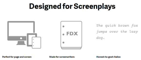
- To create faux italics, other couriers only do the work of slanting the letters. However, with the help of courier font, you can have the modeled-off casual script and the utterly new face of vintage typewriters that look outstanding.
- You may easily swap it out one for one since this Courier Font simply matches the metrics of Courier Final Draft and Courier as well. Not just this, it can be optimized for 12 point size. Thus, it’s right to say that it has been designed for screenwriters.
- No doubt, screen plays have an ample amount of white space and that is the reason why it has been made a bit heavier to balance out the things perfectly. It looks just as best on your monitor as it appears to be out of the LCD printer.
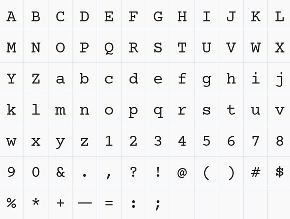
Here are the font styles for the regular font.

As compared to other couriers, Courier Prime is a somewhat dark colored and certainly it will make your life much easier. On the other hand, you may also search for other free fonts for PowerPoint presentations and now you must be wondering, what are the best PowerPoint fronts for killer presentations? Well, here are some resources for fonts such as: Dafonts.com, FontFreak, Urban Fonts, Abstract Fonts, Free Fonts, Fonts.com and more. You might also find the Courier New Font of interest, which comes with many Microsoft Office applications like PowerPoint, Excel and Word.
How to Download Courier Prime Font? Go to Google Fonts and download it from there. Alternatively, you can visit our article with free Fonts for PPT Presentations.
